Best Birthday Wishes Template

Best Birthday Wishes Template
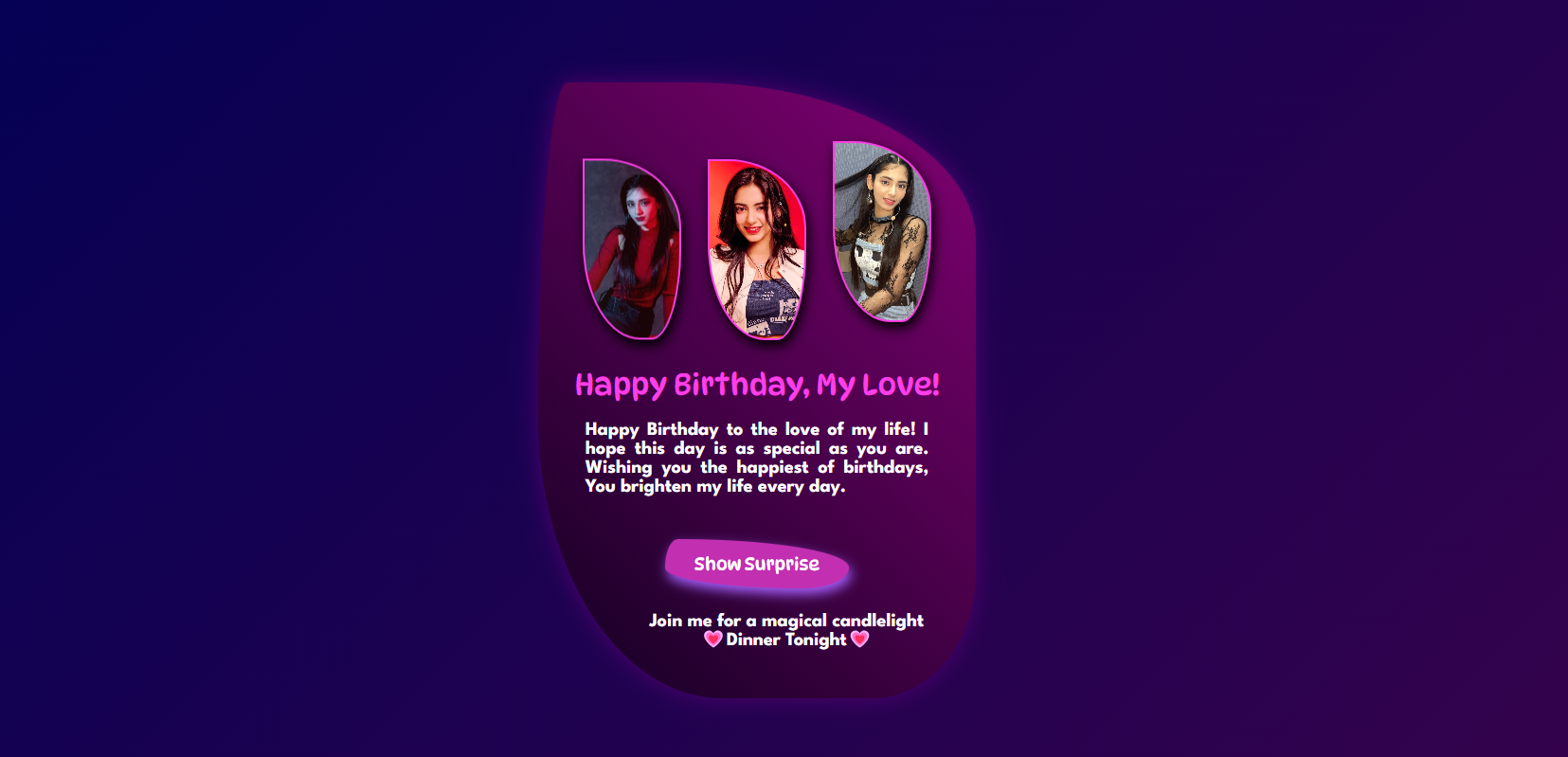
Creating personalized and visually appealing birthday cards can add a special touch to any birthday celebration. This blog post will walk you through a beautiful birthday card template created using HTML, CSS, and JavaScript. This template combines stunning background gradients, floating images, and a hidden surprise message, making it perfect for sharing your warm wishes. Let’s take a look at the code and understand how this all works!
HTML Structure
The HTML structure of this template is straightforward, with a few main sections:
DOCTYPE and META Tags: Specifies the HTML document type and viewport settings for responsiveness.
CSS Styles: Embedded CSS styles define the card’s background, text, balloon animation, and surprise message.
JavaScript: A simple JavaScript function is used to reveal the surprise message when the button is clicked.
Source Code;
Here’s the full code for the Best Birthday Wishes Template:
<!DOCTYPE html>
<html lang="en">
<head>
  <meta charset="UTF-8">
  <meta name="viewport" content="width=device-width, initial-scale=1.0">
  <title>Birthday Card</title>
  <style type="text/css" media="all">
    @import url('https://fonts.googleapis.com/css2?family=DynaPuff:[email protected]&family=League+Spartan:[email protected]&display=swap');
    body {
      display: flex;
      justify-content: center;
      align-items: center;
      height: 100vh;
      margin: 0;
      background: linear-gradient(135deg, #010154, #37024c);
    }
    .birthday-card {
      width: 350px;
      height: 500px;
      background: linear-gradient(45deg, #110021, #820173);
      border-radius: 20px;
      border-radius: 10% 99% 36% 64% / 82% 39% 31% 70%;
      padding: 10px;
      box-shadow: 0 10px 20px black;
      text-align: center;
      position: relative;
      animation: glow 2s infinite ease-in-out;
    }
    @keyframes glow {
      0%,
      100% {
        box-shadow: 0 0 15px black;
      }
      50% {
        box-shadow: 0 0 25px #9c01d9;
      }
    }
    .balloons-container {
      position: relative;
      height: 150px;
      margin-top: 60px;
      margin-bottom: 20px;
    }
    .balloon {
      width: 80px;
      height: 150px;
      border: 2px solid #fc3fe6;
      border-radius: 0% 90% 34% 66% / 53% 43% 57% 60%;
      position: absolute;
      box-shadow: 2px 5px 10px black;
      bottom: 0;
      animation: float 4s ease-in-out infinite;
    }
    .balloon1 {
      left: 8%;
      background-image: url(aria.jpg);
      background-size: contain;
      background-size: cover;
      animation-delay: 0s;
    }
    .balloon2 {
      left: 38%;
      background-image: url(aria2.jpg);
      background-size: cover;
      animation-delay: 1s;
    }
    .balloon3 {
      right: 8%;
      background-image: url(aria1.jpg);
      background-size: cover;
      animation-delay: 3s;
    }
    @keyframes float {
      0% {
        transform: translateY(0);
      }
      50% {
        transform: translateY(-20px);
      }
      100% {
        transform: translateY(0);
      }
    }
    .card-content h1 {
      font-size: 25px;
      color: #fc3fe6;
      margin-bottom: 10px;
      font-family: "DynaPuff", system-ui;
      font-optical-sizing: auto;
      font-weight: 200;
    }
    .card-content p {
      font-size: 16px;
      color: white;
      font-family: "Arima", serif;
      font-optical-sizing: auto;
      text-align: justify;
      padding: 0px 30px;
      line-height: 1;
      font-family: "League Spartan", sans-serif;
      font-weight: bold;
    }
    button {
      padding: 12px 25px;
      background-color: #c22fb1;
      color: white;
      border: none;
      border-radius: 5px;
      cursor: pointer;
      margin-top: 20px;
      transition: background-color 0.3s;
      border-radius: 7% 93% 25% 75% / 58% 58% 42% 42%;
      font-family: "DynaPuff", system-ui;
      font-weight: 100;
      font-size: 15px;
      box-shadow: 2px 5px 10px rgb(164, 93, 249);
    }
    button:hover {
      background-color: #7b0284;
    }
    .hidden-surprise {
      margin-top: 20px;
      font-size: 18px;
      color: #ff7675;
      display: none;
    }
    @keyframes slideIn {
      from {
        opacity: 0;
        transform: translateX(-100%);
      }
      to {
        opacity: 1;
        transform: translateX(0);
      }
    }
    #surprise {
      padding: 0px 30px;
      margin-left: 50px;
      text-align: center;
    }
  </style>
</head>
<body>
  <div class="birthday-card">
    <div class="balloons-container">
      <div class="balloon balloon1"></div>
      <div class="balloon balloon2"></div>
      <div class="balloon balloon3"></div>
    </div>
    <div class="card-content">
      <h1>Happy Birthday, My Love!</h1>
      <p>Happy Birthday to the love of my life! I hope this day is as special as you are. Wishing you the happiest of
        birthdays, You brighten my life every day.</p>
      <button onclick="showSurprise()">Show Surprise</button>
      <p class="hidden-surprise" id="surprise">Join me for a magical candlelight 💗Dinner Tonight💗</p>
    </div>
  </div>
  <script>
    function showSurprise() {
      const surprise = document.getElementById('surprise');
      surprise.style.display = 'block';
      surprise.style.animation = 'slideIn 1s ease';
    }
  </script>
</body>
</html>
Code Description
Background and Card Design:
The body has a linear gradient background and uses Flexbox to center the card.
The .birthday-card container is styled with a gradient background and a unique border radius to create an interesting shape.
Images Animations:
Inside the .balloons-container, three .balloon divs represent balloons.
Each balloon is given a unique background image with an animation effect (@keyframes float) to simulate floating.
Card Content:
The main content includes a header message (Happy Birthday, My Love!) and a custom message.
A button triggers the JavaScript function showSurprise() to reveal a hidden surprise message with a slide-in animation.
JavaScript Surprise Button:
The showSurprise() function toggles the display of the surprise message, making it visible with a smooth slide-in animation.
Conclusion:
This template is a perfect way to share a heartfelt, animated and visually pleasing birthday card with your loved ones. The CSS animations, colors and creative design make this card a memorable surprise! I hope you understood all these codes but if you have any doubts you can ask in the comment section, Best Birthday Wishes Template.


0 Comments