
Animated Proposal Card
Animated Proposal Card Using HTML, CSS, and JavaScript
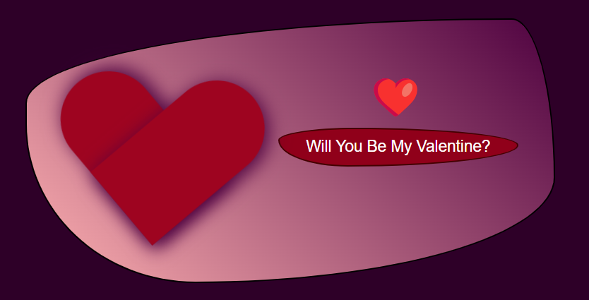
Creating an attractive animated proposal card can make the moment even more special. This blog post explains how to design an Animated Proposal Card using HTML, CSS, and JavaScript. The card has a beating heart, an attractive button, and a hidden message that reveals itself when the button is clicked. Let’s break down the code and understand how everything works.
HTML Structure;
We begin by setting up the basic structure using HTML. The main elements in the structure include a container for the card, a heart, a button to trigger the proposal, and a message that will appear when the button is clicked.
<body>
    <div class="container">
      <div id="sheart">❤️</div>
    <div class="heart"></div>
    <button class="propose-btn" onclick="showMessage()">
        Will You Be My Valentine?</button>
    <div class="message" id="message"></div>
  </div>
</body>

CSS Styling;
<style>
* {
  margin: 0;
  padding: 0;
  box-sizing: border-box;
}
body {
  display: flex;
  justify-content: center;
  align-items: center;
  height: 100vh;
  background-color: #2e0028;
  font-family: 'Arial', sans-serif;
  background-size:calc(1500%);
}
.container {
  background: linear-gradient(45deg,rgb(255, 177, 177),
  rgb(78, 1, 64));
  border: 2px solid black;
  width: 600px;
  height: 300px;
  padding-left: 10px;
  padding-top: 60px;
  border-radius: 20px;
  border-radius: 92% 8% 68% 32% / 32% 60% 40% 60%;
  text-align: center;
  position: relative;
  animation: borderRadiusAnimation 5s infinite;
}
@keyframes borderRadiusAnimation {
  0% {
    border-radius: 29% 71% 34% 66% / 51% 75% 25% 49%;
  }
  50% {
    border-radius: 92% 8% 68% 32% / 32% 60% 40% 60%;
  }
  100% {
    border-radius: 29% 71% 34% 66% / 51% 75% 25% 49%;
  }
}
.heart {
  width: 100px;
  height: 90px;
  position: relative;
  display: inline-block;
  animation: pulse 1.5s infinite;
}
.heart::before,
.heart::after {
  content: '';
  width: 100px;
  height: 180px;
  border-radius: 100px 100px 0 0;
  background-color: #9e0420;
  box-shadow: 5px 0px 19px 1px rgb(78, 1, 64);
  position: absolute;
}
.heart::before {
  left: 100px;
  top: 0;
  transform: rotate(-45deg);
  transform-origin: 0 100%;
}
.heart::after {
  left: 0;
  top: 0;
  transform: rotate(45deg);
  transform-origin: 100% 100%;
}
@keyframes pulse {
  0%, 100% {
    transform: scale(1) rotate(4deg);
  }
  50% {
    transform: scale(1.1) rotate(5deg);
  }
}
.propose-btn {
margin-left: 130px;
  margin-top: 20px;
  padding: 10px 30px;
  background-color: #90001a;
  border: 2px solid rgb(67, 0, 0);
  color:white;
  border-radius: 32% 68% 71% 29% / 32% 45% 55% 68%;
  font-size: 18px;
  cursor: pointer;
  transition: background-color 0.3s ease;
}
.propose-btn:hover {
  background-color: #ff0090;
}
.propose-btn:active {
  background-color: #8d0251;
}
.message {
  margin-left: 150px;
  margin-top: 20px;
  font-size: 17px;
  color:#3c0000;
  font-weight: bold;
  visibility: hidden;
  opacity: 0;
  transition: visibility 0s, opacity 0.5s ease;
}
#sheart{
  font-size: 50px;
  position: absolute;
  top: 50px;
  left: 70%;
  transform: translate(-50%);

}
</style>
General Styling
- The * selector is used to remove any default margins and paddings. We center the container in the viewport and apply a dark background color to give a romantic feel.
Container Styling
- The container class holds all the elements of the card. We use a gradient background for a warm and elegant effect. The border-radius property is animated using a keyframe animation to make the card appear to breathe or morph, adding a dynamic visual effect.
Heart Animation
- The heart element is created using pseudo-elements (::before and ::after). The two pseudo-elements are positioned and rotated to form a heart shape. The pulse animation makes the heart beat, giving the card a lively appearance.
Button Styling
- The button is styled to fit the romantic theme with rounded corners and a soft hover effect. When hovered, the button changes color, encouraging interaction.
Message Display
- The message is hidden by default. When the button is clicked, JavaScript sets the visibility and opacity, smoothly revealing the message.
JavaScript Functionality
<script type="text/JavaScript">
    function showMessage() {
      const messageElement = document.getElementById("message");
      messageElement.textContent = "Yes, you’re my perfect Valentine!";
      messageElement.style.visibility = "visible";
      messageElement.style.opacity = 2;
      }
</script>
The JavaScript function showMessage() is used to display the hidden message. It changes the text content of the message element and makes it visible by adjusting the visibility and opacity properties.
Conclusion;
This animated proposal card is a creative way to make someone your valentine. The combination of the animated border, beating heart, and a revealing message makes the card stand out and leave a lasting impression.
Also Learn;


0 Comments