3D Flip Birthday Card with CSS
Creating a Stunning 3D Flip Birthday Card with CSS
Are you tired of giving the same old traditional birthday cards? Do you want to add a touch of creativity and surprise to your loved one’s special day? Look no further! In this blog post, we’ll explore how to create a stunning 3D flip birthday card with CSS that will surely leave a lasting impression. With just a few lines of code and some imagination, you can craft a unique and personalized greeting that will make the recipient’s heart skip a beat.
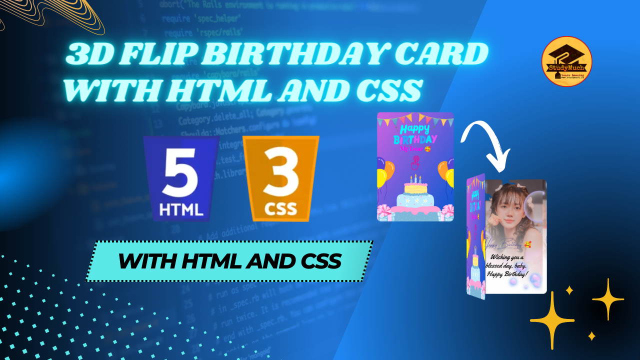
Before we dive into the code, let’s take a moment to appreciate the beauty of this interactive card. The 3D flip effect adds an element of intrigue and excitement, making the birthday card stand out from the rest. When the card is initially displayed, it appears as a closed book. However, with a simple hover action, the card gracefully flips open, revealing the surprise inside.
HTML Structure
Let’s start by setting up the HTML structure for our 3D flip birthday card. Here’s the basic code:
<body>
  <div id="container">
   <div class="book">
     <!-- <p>Text Here</p> -->
   <div class="cover">
      <!-- <p>Text Here</p> -->
   </div>
   </div>
 </div>
</body>
In the above code, we have a simple HTML structure. The first div element acts as the container for our flip card, and it contains two child elements: .book and .cover. These elements represent our 3D flip card, respectively.
CSS Styling
Now that we have the HTML structure in place, let’s move on to the CSS styling. We’ll use CSS to create the 3D flip effect and customize the appearance of the card. Create a new file called styles.css and link it to your HTML file using the <link>
tag in the <head> section.
Here’s the CSS code for our 3D flip birthday card:
<style>
  body {
    background-image: linear-gradient
    (135deg, #667eea 0%, #764ba2 100%);
  }
  #container {
    display: flex;
    justify-content: center;
    align-items: center;
    min-height: 100vh;
  }
  .book {
    position: relative;
    border-radius: 10px;
    width: 210px;
    height: 300px;
    background-image: url(bdycard.png);
    background-size: cover;
    background-position: center;
    background-size: 90%;
    -webkit-box-shadow: 1px 1px 12px #000;
    box-shadow: 1px 1px 12px #000;
    -webkit-transform: preserve-3d;
    -ms-transform: preserve-3d;
    transform: preserve-3d;
    -webkit-perspective: 2000px;
    perspective: 2000px;
    display: -webkit-box;
    display: -ms-flexbox;
    display: flex;
    flex-direction: column;
    -webkit-box-align: center;
    -ms-flex-align: center;
    align-items: center;
    -webkit-box-pack: center;
    -ms-flex-pack: center;
    justify-content: center;
   }
  .cover {
    top: 0;
    position: absolute;
    background-color: lightgray;
    background-color: #4158D0;
    background-image: url(bdycard1.png);
    background-size: cover;
    background-position: center;
    width: 100%;
    height: 100%;
    border-radius: 10px;
    cursor: pointer;
    -webkit-transition: all 0.5s;
    transition: all 0.5s;
    -webkit-transform-origin: 0;
    -ms-transform-origin: 0;
    transform-origin: 0;
    -webkit-box-shadow: 1px 1px 12px #000;
    box-shadow: 1px 1px 12px #000;
    display: -webkit-box;
    display: -ms-flexbox;
    display: flex;
    -webkit-box-align: center;
    -ms-flex-align: center;
    align-items: center;
    -webkit-box-pack: center;
    -ms-flex-pack: center;
    justify-content: center;
  }
  .book:hover .cover {
    -webkit-transition: all 0.5s;
    transition: all 0.5s;
    -webkit-transform: rotatey(-85deg);
    -ms-transform: rotatey(-85deg);
    transform: rotatey(-85deg);
  }
  </style>
Code Explanation;
Let’s break down the code step by step:
- First, we define the basic structure of the HTML document, including the necessary tags.
- We set the background image of the body element using a linear gradient to create a visually appealing backdrop for the card.
- The #container div is responsible for centering the card vertically and horizontally on the page.
- Inside the #container, we have the book div, which represents the closed book shape of the card. It has a fixed width and height, and we set a background image using the bdycard.png file.
- The book div is transformed into a 3D space using CSS properties like transform and perspective. These properties allow us to create the illusion of depth and rotation.
- Inside the book div, we have another div called cover. This div represents the front cover of the card. It has a background color, an image set by bdycard1.png, and a cursor: pointer property to indicate that it can be interacted with.
- Finally, we define a CSS transition on the cover class, specifying that when the user hovers over the book, the cover should rotate around the y-axis (rotatey) by -85 degrees, giving the flip effect.
With this code in place, you can customize the background images and dimensions of the card to match your preferences. You can replace bdycard.png with your desired image for the closed book, and bdycard1.png with the image you want to reveal when the card is opened.
Feel free to experiment with different images, colors, and sizes to create a unique and personalized 3D flip birthday card. Imagine the surprise and joy on your loved one’s face when they receive such a special and interactive greeting! Remember to save your modified HTML file and open it in a web browser to see the magic of the 3D flip birthday card in action.
Conclusion
Congratulations! You’ve successfully created a stunning 3D flip birthday card using CSS. By combining HTML and CSS, you’ve brought interactivity and excitement to the traditional concept of a birthday card. The 3D flip effect adds a delightful surprise and will surely make your loved one’s special day even more memorable.
Remember to save your HTML and CSS files in the same directory and open the HTML file in a web browser to see the magic of the 3D flip birthday card come to life. You can further customize the styling, dimensions, and content to create unique and personalized birthday cards for your friends and family. Now, it’s time to spread joy and celebrate those special moments with your beautifully crafted 3D flip birthday cards. Happy coding and happy birthday wishes!
Learn More;


0 Comments