Valentine’s Day Card

Creating a Valentine’s Day Card with HTML and CSS
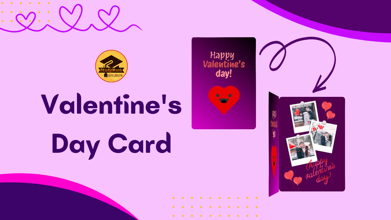
Valentine’s Day is a special occasion to express love and affection to your significant other. In this tutorial, we’ll create a charming Valentine’s Day card using HTML and CSS. The card features a heart, a smiley face, and a stylish cover with a handwritten font. so let’s start the learning.

HTML Structure
Let’s start by setting up the HTML Structure for our Valentine’s Day Card.
<!DOCTYPE html>
<html lang="en">
<head>
  <meta charset="UTF-8">
  <meta name="viewport" content="width=device-width, initial-scale=1.0">
  <link rel="preconnect" href="https://fonts.googleapis.com">
  <link rel="preconnect" href="https://fonts.gstatic.com" crossorigin>
  <linkhref="https://fonts.googleapis.com/css2?family=Protest+Revolution&family=Protest+Riot&display=swap"
  rel="stylesheet">
  <title>Valentine Day Card by StudyMuch</title>
  <link rel="stylesheet" href="styles.css">
  <!-- Add your CSS Style here -->
</head>
<body>
 <div id="container">
  <div class="book">
   <div class="cover">
   <div class="notes">Happy</div>
   <div class="heart"></div>
   <div class="smile"></div>
   <div class="eyes"></div>
  </div>
 </div>
</div>
</body>
</html>
HTML Code Description;
This HTML Structure provides the foundation for the Valentine’s Day card, which is then styled and animated using CSS.
- <link rel=”preconnect” href=”https://fonts.googleapis.com”>: Instructs the browser to perform an early connection to the Google Fonts server.
- <link rel=”preconnect” href=”https://fonts.gstatic.com” crossorigin>: Similar to the previous line, but specifically for the Google Fonts static content.
- <link href=”https://fonts.googleapis.com/css2?family=Protest+Revolution&family=Protest+Riot&display=swap” rel=”stylesheet”>: Imports Google Fonts for use in the document, including the “Protest Revolution” and “Protest Riot” fonts.
- <div class=”book”>: A div with the class “book” that represents the overall structure of the Valentine’s Day card.
- <div class=”cover”>: A div with the class “cover” that contains the visual elements of the card, including a note, heart, smile, and eyes.
- <div class=”notes”>Happy</div>: A div with the class “notes” containing the text “Happy” to be displayed on the card cover.
- <div class=”heart”></div>: A div with the class “heart” representing a heart shape, styled using CSS.
- <div class=”smile”></div>: A div with the class “smile” representing a smiling face, styled using CSS.
- <div class=”eyes”></div>: A div with the class “eyes” representing eyes, styled using CSS.
CSS Styles
Now, let’s break down the CSS into three sections: Card CSS Style Code. Heart CSS Style Code, and Text CSS Style Code.
#container{
  display: flex;
  justify-content: center;
  align-items: center;
  min-height: 100vh;
  background-color: rgb(238, 144, 255);
}
.book{
  position: relative;
  border-radius: 10px;
  width: 210px;
  height: 300px;
  /* Internal Image, upload your couple image here */*/
  background-image: url(https://shorturl.at/euzMR);
  background-size: cover;
  background-position: center;
  background-size: 97%;
  -webkit-box-shadow: 1px 1px 12px black;
  box-shadow: 1px 1px 12px black;
  -webkit-transform: preserve-3d;
  -ms-transform: preserve-3d;
  transform: preserve-3d;
  -webkit-perspective: 2000px;
  perspective: 2000px;
}
.cover{
  top: 0;
  position: absolute;
  background-color: lightgray;
  background-image: linear-gradient( 40deg,rgb(218, 1, 203) , black);
  background-size: cover;
  background-position: center;
  width: 100%;
  height: 100%;
  border-radius: 10px;
  cursor: pointer;
  -webkit-transition: all 0.5s;
  transition: all 0.5s;
  -webkit-transform-origin: 0;
  -ms-transform-origin: 0;
  transform-origin: 0;
  -webkit-box-shadow: 1px 1px 12px black;
  box-shadow: 1px 1px 12px black; }

.book:hover .cover{
 -webkit-transition: all 0.5s;
 transition: all 0.5s;
 -webkit-transform: rotatey(-85deg);
 -ms-transform: rotateY(-85deg);
 transform: rotatey(-95deg);
}

Heart CSS Styling;
Now let’s see the CSS Styling of Heart, how to design the animated Heard in the front cover of Valentine’s Card.
.heart {
  position: relative;
  background-color: #e60303;
  height: 60px;
  width:60px;
  top:180px;
  left:75px;
  transform: rotate(-45deg);
  animation: .8s beat infinite;
}
.heart:before, .heart:after {
  content:"";
  background-color: #e60303;
  border-radius:50%;
  height: 60px;
  width: 60px;
  position: absolute;
}
.heart:before {
  top:-30px;
  left:0;
}
.heart:after {
  left:30px;
  top:0;
}
.smile {
  position: absolute;
  width:30px;
  height:15px;
  background-color: #333;
  z-index:1;
  border-radius: 0 0 100px 100px;
  top:200px;
  left:90px;
  overflow: hidden;
}
.smile:before {
  content:"";
  position: absolute;
  border-radius:50%;
  width:20px;
  height:20px;
  background-color: #030202;
  top:5px;
  left:5px;
}
.eyes {
  position: absolute;
  border-radius: 50%;
  background-color: #333;
  width:10px;
  height:10px;
  z-index:1;
  top:185px;
  left:120px;
  box-shadow: -40px 0 #333;
  transform-origin: 50%;
  animation: close 2s infinite;
}
@keyframes close {
  0%, 100% {
    transform: scale(1, .05);
    }
  5%, 95% {
        transform: scale(1, 1);
    }
}
@keyframes beat {
  0%, 40%, 100% {
    transform: scale(1) rotate(-45deg);
  }
  25%, 60% {
    transform: scale(1.1) rotate(-45deg);
  }
}
Text CSS Styling;
Now, let’s look at how to style the text that appears on the card cover. Font Style have been used from google font style.
.notes {
  position: absolute;
  color: #ff9595;
  font-size: 30px;
  top:40px;
  width:200px;
  text-align: center;
  font-family: 'Protest Revolution', sans-serif;
}
.notes:before, .notes:after {
  position: absolute;
  left:5px;
  text-align: center;
  width:200px;
}
.notes:before {
  content:"Valentine's";
  top:30px;
  color: #d04e4e;
  font-family: 'Protest Riot', sans-serif;
}
.notes:after {
  content:"day!";
  top:60px;
  font-family: 'Protest Riot', sans-serif;
}
Conclusion;
Finally, creating Valentine’s Day Card using HTML and CSS, lets you combine creativity with coding skills to craft a unique and heartfelt digital greeting. This tutorial provides a step-by-step guide to creating a charming card with a heart, smiley face, and a stylish cover. Feel free to experiment with this code, change the styles, or add additional elements to make the card truly your own. Whether you’re creating this card for a special someone or as a fun project, this tutorial serves as a starting point for expressing your creativity through web development. Happy Coding, and Happy Valentine’s Day!
Learn More;


1 Comment
smorter giremal · November 4, 2024 at 5:31 pm
Whoa! This blog looks exactly like my old one! It’s on a completely different topic but it has pretty much the same page layout and design. Superb choice of colors!