
CSS Animated Card
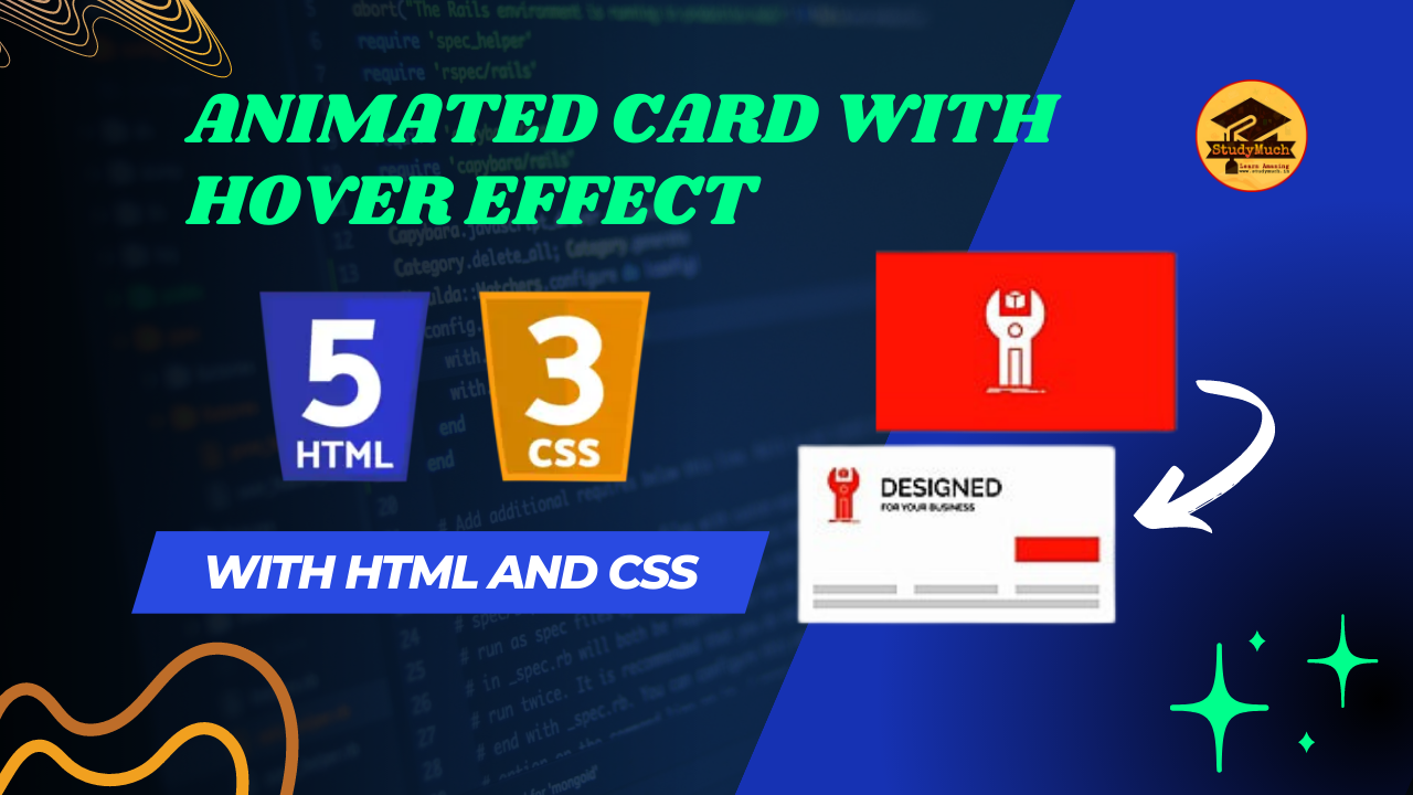
CSS Animated Card: A Creative Touch to Your Web Design
CSS animations provide a powerful way to add engaging and interactive elements to your web pages. In this blog post, we will explore how to create an animated and hover effect card using HTML and CSS. This animated card will bring life to your website by adding smooth and visually appealing transitions. So, let’s dive into the code and create a stunning CSS Animated Card!
HTML Structure:
To begin, we’ll define the basic HTML structure for our hover effect animated card. The card will consist of a container div with two child divs for the first Card Style and Second Card Style. Here’s the HTML code:
<body>
  <div class="card-container">
    <div class="card">
     <img src="sm.png"  alt="card img">
     <div class="card__content">
       <p class="card__title">StudyMuch</p>
       <p class="card__description">Description</p>
   </div>
   </div>
     <div class="card" id="card1">
      <img src="sm.png" alt="card img">
      <div class="card__content" id="card1__content">
        <p class="card__title">StudyMuch</p>
        <p class="card__description"> Description</p>
     </div>
   </div>
 </div>
</body>
CSS Styling:
Now that we have the HTML structure in place, let’s add some CSS styles to create the animated card. We’ll use CSS transforms and transitions to achieve the desired effect. Here’s the CSS code:
<style>
  .card-container{
    display: flex;
    flex-wrap: wrap;
    justify-content: center;
   align-items: center;
        }
  .card {
    position: relative;
    width: 300px;
    height: 200px;
    margin: 10px 20px;
    background-color: #f2f2f2;
    border-radius: 20px 0px;
    display: flex;
    align-items: center;
    justify-content: center;
    overflow: hidden;
    perspective: 1000px;
    box-shadow: 1px 2px 15px 5px #7eb4fa;
    transition: all 0.6s cubic-bezier
     (0.175, 0.885, 0.32, 1.275);

        }
  .card img {
    width: 100%;
    height: 100%;
    fill: #333;
    background-size: cover;
    background-position: center;
    transition: all 0.9s cubic-bezier
    (0.175, 0.885, 0.32, 1.275);
        }

  .card:hover {
    transform: scale(1.05);
    ox-shadow: 0 8px 16px rgba
     (255, 255, 255, 0.2);
   }
 .card__content {
   position: absolute;
   top: 0;
   left: 0;
   width: 100%;
   height: 100%;
   padding: 20px;
   box-sizing: border-box;
   background-image: linear-gradient
  (to top, #09203f0%, #537895 100%);
   transform: rotateX(-100deg);
   transform-origin: top;
   transition: all 0.9s cubic-bezier
  (0.175, 0.885, 0.32, 1.275);
   cursor: pointer;
   }

 .card:hover .card__content {
   transform: rotateX(0deg);
    }
 .card__title {
   margin: 0;
   font-size: 24px;
   color: #ffffff;
   font-weight: 700;
    }
  .card__description {
    margin: 10px 0 0;
    font-size: 14px;
    color: #c2c2c2;
    line-height: 1.4;
    }
  #card1:hover img {
    scale: 0;
    }
</style>
Explanation;
This code defines the styles for the container that holds the card elements. It sets the container to use flexbox, allowing the cards to be horizontally centered and wrap to the next line if necessary.
The overflow: hidden property hides any content that exceeds the card’s boundaries. The perspective property creates a 3D perspective for any child elements with transformed properties. The transition property defines the animation duration and timing function for the card.
The fill property sets the color of any SVG content within the image. The background-size property ensures the image covers the entire space, and background-position centers the image within the container. The transition property defines the animation duration and timing function for the image.
The transform-origin property sets the rotation origin to the top of the content. The transition property defines the animation duration and timing function for the content. The cursor: pointer property changes the cursor to a pointer shape when hovering over the content.
This code targets a specific card (#card1) and hides its image when hovered over by setting the scale property to 0.
Conclusion:
By combining HTML and CSS, we have successfully created an impressive animated card. This card incorporates hover effects, transitions, and rotations to provide an engaging and interactive user experience. Feel free to customize the content, images, colors, and dimensions to match your design requirements.
Experiment with different CSS properties, animations, and transitions to further enhance the card’s appearance and interactivity. The possibilities are endless when it comes to creating unique and captivating animated cards for your web projects.
More HTML;


8 Comments
best cheap seo services · August 10, 2023 at 10:44 am
I value the post. Will read on…
URl to MP3 · December 16, 2023 at 8:30 am
You made some respectable factors there. I looked on the web for the issue and located most people will go along with together with your website.
Go Here · December 27, 2023 at 9:01 am
Magnificent web site. Lots of useful information here. I?m sending it to a few pals ans additionally sharing in delicious. And certainly, thank you to your effort!
kontol kuda · February 10, 2024 at 11:15 pm
What i do not understood is in fact how you are not actually a lot more smartly-appreciated than you may be right now. You are so intelligent. You know therefore significantly in the case of this topic, made me personally consider it from so many numerous angles. Its like women and men are not interested unless it is one thing to accomplish with Lady gaga! Your own stuffs excellent. All the time handle it up!
Spa Salon Forest Hills · February 11, 2024 at 9:50 am
I really appreciate this post. I have been looking all over for this! Thank goodness I found it on Bing. You’ve made my day! Thanks again
bokep jepang · April 30, 2024 at 9:16 am
Hi there! I know this is kinda off topic but I was wondering which blog platform are you using for this website? I’m getting fed up of WordPress because I’ve had problems with hackers and I’m looking at alternatives for another platform. I would be fantastic if you could point me in the direction of a good platform.
situs porno · May 7, 2024 at 4:45 am
Terrific work! This is the type of info that should be shared around the internet. Shame on Google for not positioning this post higher! Come on over and visit my site . Thanks =)
Rummy list · May 9, 2024 at 2:07 pm
The information shared is of top quality which has to get appreciated at all levels. Well done…