
Animated Cube Album using HTML, CSS
Animated Cube Album using HTML, CSS
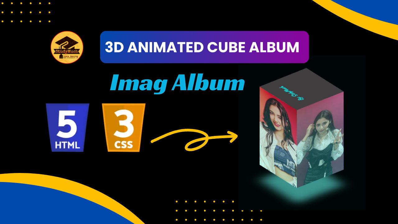
Welcome! In this blog post, we are going to learn how to create an Animated Cube Album using HTML, CSS. This fascinating project combines creativity and technical skills to create an eye-catching 3D Cube that displays images in a unique and dynamic way.
Introduction
The animated cube album is a modern and stylish way to present a collection of images. It features a rotating cube with images on its faces, creating an eye-catching and interactive user experience. The cube animation is achieved using CSS keyframes and transforms, providing a smooth and lovely visual effect.

HTML Structure
Let’s break down the HTML Structure of our animated cube album:
<!DOCTYPE html>
<html lang="en">
<head>
  <!-- Meta tags and stylesheets -->
</head>
<body>
<div class="cube-loader">
  <div class="cube-top">
  <p>By: StdyMuch</p>
  </div>
<div class="cube-wrapper">
  <span style="--i:0" class="cube-span">
    <!-- Insert Your image here-->
    <img src="aria.jpg" alt="">
  </span>
  <span style="--i:1" class="cube-span">
    <img src="aria1.jpg" alt="">
  </span>
  <span style="--i:2" class="cube-span">
    <img src="aria2.jpg" alt="">
  </span>
  <span style="--i:3" class="cube-span">
    <img src="aria4.jpg" alt="">
  </span>
 </div>
</div>
</body>
</html>
Code Description;
This HTML Code represents the structure of a webpage that includes an animated cube album. Let’s break down the code section by section: In summary, this HTML code sets up the structure for an animated cube album with placeholder images. The cube rotates, and each face displays a different image.
- ‘<!DOCTYPE html>’: This declaration defines the document type and version of HTML being used, ensuring that the browser interprets the document correctly.
- ‘<html lang=”en”>’: This opening tag marks the beginning of the HTML document, and the lang attribute specifies the language as English.
- ‘<head>’: The head section of the document contains metadata and links to external resources. In this case, it includes comments indicating that meta tags and stylesheets can be added here.
- ‘<body>’: The body section contains the content of the HTML document that will be displayed on the webpage.
- ‘<div class=”cube-loader”>’: This div element serves as a container for the animated cube loader. It wraps two main components: cube-top and cube-wrapper.
- ‘<div class=”cube-top”>’: This div represents the top face of the rotating cube. Inside it, there is a p element displaying the author information “By: StdyMuch.”
- ‘<div class=”cube-wrapper”>’: This div serves as a container for the cube’s sides (or faces). Inside it, there are four span elements, each representing an image on one face of the cube.
- ‘<span style=”–i:0″ class=”cube-span”>’: These span elements have a custom property –i set to different values (0, 1, 2, 3) using the style attribute. This property is likely used to control the rotation angle of each image when the cube animates. The class cube-span is applied for styling purposes.
- ‘<img src=”aria.jpg” alt=””>’: Inside each span, there is an img (image) element with a source (src) attribute pointing to an image file (e.g., “aria.jpg”) and an empty alt attribute for accessibility.

CSS Styles
Now, let’s look at the CSS Styles that bring our animated cube album to life:
body{
  display: flex;
  justify-content: center;
  align-items: center;
  background-color: rgb(0, 6, 7);
  min-height: 50vh;
  }
.cube-loader {
  position: relative;
 /* u can choose any size */
  width: 100px;
  height: 150px;
  transform-style: preserve-3d;
  transform: rotateX(-30deg);
  animation: animate 4s linear infinite; }

@keyframes animate {
  0% {
    transform: rotateX(-30deg) rotateY(0);
  }
  100% {
    transform: rotateX(-30deg) rotateY(360deg);
  }
}
.cube-loader .cube-wrapper {
  position: absolute;
  width: 100%;
  height: 100%;
  transform-style: preserve-3d;
}
.cube-loader .cube-wrapper .cube-span {
  position: absolute;
  width: 100%;
  height: 100%;
  /* width 100px / 2 = 50px */
  transform: rotateY(calc(90deg * var(--i))) translateZ(50px);
  background: linear-gradient(
  to bottom,
  hsl(330, 3.13%, 25.1%) 0%,
  hsl(177.27, 21.71%, 32.06%) 5.5%,
  hsl(176.67, 34.1%, 36.88%) 12.1%,
  hsl(176.61, 42.28%, 40.7%) 19.6%,
  hsl(176.63, 48.32%, 43.88%) 27.9%,
  hsl(176.66, 53.07%, 46.58%) 36.6%,
  hsl(176.7, 56.94%, 48.91%) 45.6%,
  hsl(176.74, 62.39%, 50.91%) 54.6%,
  hsl(176.77, 69.86%, 52.62%) 63.4%,
  hsl(176.8, 76.78%, 54.08%) 71.7%,
  hsl(176.83, 83.02%, 55.29%) 79.4%,
  hsl(176.85, 88.44%, 56.28%) 86.2%,
  hsl(176.86, 92.9%, 57.04%) 91.9%,
  hsl(176.88, 96.24%, 57.59%) 96.3%,
  hsl(176.88, 98.34%, 57.93%) 99%,
  hsl(176.89, 99.07%, 58.04%) 100%
 );
}
img{
  width: 100px;
  height: 150px;
  filter: opacity(0.7);
}
.cube-top {
  position: absolute;
  width: 100px;
  height: 100px;
  background: hsl(330, 3.13%, 25.1%) 0%;
             /* width 100px / 2 = 50px */
  transform: rotateX(90deg) translateZ(50px);
  transform-style: preserve-3d;
}
.cube-top::before {
  content: '';
  position: absolute;
  width: 100px;
  height: 100px;
  background: hsl(176.61, 42.28%, 40.7%) 19.6%;
  transform: translateZ(-180px);
  filter: blur(10px);
  box-shadow: 0 0 10px #323232,
              0 0 20px hsl(176.61, 42.28%, 40.7%) 19.6%,
              0 0 30px #323232,
              0 0 40px hsl(176.61, 42.28%, 40.7%) 19.6%;
}
p{
  margin: 20px;
  color: aqua;
  font-size: 12px;
  font-family: "Caveat", cursive;
  font-weight: bold;
}
The CSS styles define the appearance and animation of the cube. The @keyframes animate rule controls the rotation of the cube, and various styles are applied to achieve the gradient background, image positions, and shadow effects.
Conclusion
Creating an animated cube album using HTML, CSS allows you to display your images in a captivating and interactive way. Feel free to customize the code and experiment with different styles to make it uniquely yours. We hope this tutorial inspires you to explore the creative possibilities of web development! Happy coding!
Learn More;


0 Comments