CSS Image Filter
CSS Image Filter
In this tutorial we will learn how to filter the image with the help of CSS properties, here we filter the image with different – different ways, such as we can filter the color, set blur image, brightness, rotate, opacity, saturated, shadow, contract etc.
To doing this we need to use the filter CSS property through this property we apply graphical effect in image. Now you see the below how we filtered the image in different ways with programming examples and output also.
Here we apply the many filter’s valid value to filter the image, now you see one by one all value of filter with programming examples below.
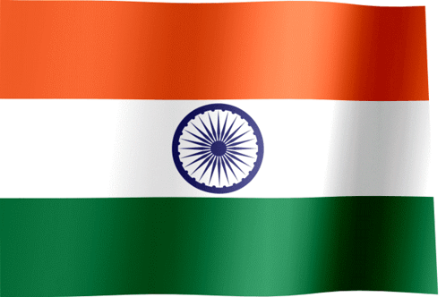
First you see the one image without filter apply, here we use CSS property filter: none; value to not change any property of image.
Programming Examples, filter: none;
<!DOCTYPE html> <html lang="en"> <head> <meta charset="UTF-8"> <meta http-equiv="X-UA-Compatible" content="IE=edge"> <meta name="viewport" content="width=device-width, initial-scale=1.0"> <title>Image Filter</title> <style type="text/css"> img{filter: none; max-width: 100%; height: auto;} </style> </head> <body> <img src="webimg12.jpg"alt="StydyMuch.in"> </body> </html> |
Output of above programming example;

Image Blur Filter
Here we filter image with blur filter, now we blur the image with using the filter property with valid value blur. Below see the programming and output also.
Programming Examples of ‘Blur’ Filter
<!DOCTYPE html> <html lang="en"> <head> <meta charset="UTF-8"> <meta http-equiv="X-UA-Compatible" content="IE=edge"> <meta name="viewport" content="width=device-width, initial-scale=1.0"> <title>Image Filter</title> <style type="text/css"> img{filter:blur(2px); max-width: 100%; height: auto;} </style> </head> <body> <img src="webimg12.jpg" alt="StydyMuch.in"> </body> </html> |
Output of above programming examples;
 Above you can see the output of Blur Filter, the image is blurs. Here we used the Blur value “filter: blur(2px);“ in Filter property so the image is blurred. You can increase and decrease the blue using value like px.
Image Brightness Filter
Now here we set the brightness of image, using the filter property and put valid value brightness filter: brightness (0.7), see below the programming examples with output.
Programming Example of Image Brightness Filter;
<!DOCTYPE html> <html lang="en"> <head> <meta charset="UTF-8"> <meta http-equiv="X-UA-Compatible" content="IE=edge"> <meta name="viewport" content="width=device-width, initial-scale=1.0"> <title>Image Filter</title> <style type="text/css"> img{filter:brightness(1.6); max-width: 100%; height: auto;} </style> </head> <body> <img src="webimg12.jpg" alt="StydyMuch.in"> </body> </html> |
Output of above programming example Image Brightness Filter;
 Above you can see the output of programming example Image Brightness Filter, there we used the “filter: brightness(1.6)” to increase the brightness of image, you can increase and decrease the brightness through the put the value.
Image Contrast Filter
Now here we filter the image with contrast valid value, you can put the value your choice to set the contrast of image. Below looks the programming example to understanding better.
Programming Example of Image Contrast Filter;
<!DOCTYPE html> <html lang="en"> <head> <meta charset="UTF-8"> <meta http-equiv="X-UA-Compatible" content="IE=edge"> <meta name="viewport" content="width=device-width, initial-scale=1.0"> <title>Image Filter</title> <style type="text/css"> img{filter:contrast(200%); max-width: 100%; height: auto;} </style> </head> <body> <img src="webimg12.jpg" alt="StydyMuch.in"> </body> </html> |
Output of above programming example Contrast Filter;
 Above you can see the output of Contrast programming, the image sown above is contrasted 200%, Using property filter: contrast(200%);
to apply this filter.
Image Drop Shadow Filter
Here we set the image drop-shadow, that means simple we can say shadow of image. For apply this filter just used to filter: drop-shadow(10px 12px 14px);. Look below the programming example to better understanding.
Programming Example of Image Drop Shadow Filter;
<!DOCTYPE html> <html lang="en"> <head> <meta charset="UTF-8"> <meta http-equiv="X-UA-Compatible" content="IE=edge"> <meta name="viewport" content="width=device-width, initial-scale=1.0"> <title>Image Filter</title> <style type="text/css"> img{filter: drop-shadow(12px 12px 16px blue); max-width: 100%; height: auto;} </style> </head> <body> <img src="webimg12.jpg" alt="StydyMuch.in"> </body> </html> |
Output of above programming example;
 Above you can see the output of programming example, look image drop-shadow here we use filter: drop-shadow(12px 13px 16px red).
Image Grayscale Filter
Now we use the image grayscale filter to set gray and also change blacken white picture with using this property. To using this property we apply filter: grayscale(20%);. To apply this property, use valid value in percentage.
Programming Example of Image Grayscale Filter;
<!DOCTYPE html> <html lang="en"> <head> <meta charset="UTF-8"> <meta http-equiv="X-UA-Compatible" content="IE=edge"> <meta name="viewport" content="width=device-width, initial-scale=1.0"> <title>Image Filter</title> <style type="text/css"> img{filter: grayscale(70%); max-width: 100%; height: auto;} </style> </head> <body> <img src="webimg12.jpg" alt="StydyMuch.in"> </body> </html> |
Output of above programming example;

Above programming output, you can see the image color is change in grays, to increase and decrease the grays use value in percentage.
Change Color of Image (hue-rotate)
Here we change the color of image using the filter property and put valid value hue-rotate. For better understanding look below the programming example.
Programming Example of hue-rotate Filter;
<!DOCTYPE html> <html lang="en"> <head> <meta charset="UTF-8"> <meta http-equiv="X-UA-Compatible" content="IE=edge"> <meta name="viewport" content="width=device-width, initial-scale=1.0"> <title>Image Filter</title> <style type="text/css"> img{filter:hue-rotate(80deg); max-width: 100%; height: auto;} </style> </head> <body> <img src="webimg12.jpg" alt="StydyMuch.in"> </body> </html> |
Output of above programming example hue-rotate Filter;

|


Above you can see the three image output of programming example above. There we change the color of image using value “30deg, 50deg and 100deg”.
Image Invert Filter
Now here we used the invert filter to change and looking the negative type image, for apply this putting the percentage value. Look below programming example.
Programming Example of Invert Image Filter;
<!DOCTYPE html> <html lang="en"> <head> <meta charset="UTF-8"> <meta http-equiv="X-UA-Compatible" content="IE=edge"> <meta name="viewport" content="width=device-width, initial-scale=1.0"> <title>Image Filter</title> <style type="text/css"> img{filter:invert(80%); max-width: 100%; height: auto;} </style> </head> <body> <img src="webimg12.jpg" alt="StydyMuch.in"> </body> </html> |
Output of above programming example Invert Filter;

|


You can see the above programming out, there three types of filters in invert value in filter property. You can change the invert filter using the percentage value.
Saturate & Sepia value to Filter Image
Here we use the Saturate and Sepia
value to filter the image, to using the saturate value, simply use the filter: saturate(30%) put value in percentage. And to using and set the sepia value simply put the filter value like filter: sepia(10%). In both sepia and saturate put percentage value to use it. Look below the programming example.
Programming Example of Saturate & Sepia value;
<!DOCTYPE html> <html lang="en"> <head> <meta charset="UTF-8"> <meta http-equiv="X-UA-Compatible" content="IE=edge"> <meta name="viewport" content="width=device-width, initial-scale=1.0"> <title>Image Filter</title> <style type="text/css"> #img1{filter: saturate(10%); max-width: 100%; height: auto;} #img2{filter: sepia(70%); max-width: 100%; height: auto;} </style> </head> <body> <img id="img1" src="webimg12.jpg"alt="StydyMuch.in"> <img id="img2" src="webimg12.jpg"alt="StydyMuch.in"> </body> </html> |
Output of above programming example of Saturate & Sepia value;
|
|

Above you can see the programming output, the first image is using saturate value and second image is using sepia value in filter property of CSS. Each image is different color and property, you can increase and decrease the saturate and sepia by using the percentage value.
Opacity of Image
Through using this opacity property of CSS, you can make transparent image also. Now here we used this property in many different – different percentage value, to understand better.
Programming Example Opacity;
<!DOCTYPE html> <html lang="en"> <head> <meta charset="UTF-8"> <meta http-equiv="X-UA-Compatible" content="IE=edge"> <meta name="viewport" content="width=device-width, initial-scale=1.0"> <title>Image Filter</title> <style type="text/css"> #img1{filter:opacity(30%); max-width: 100%; height: auto;} #img2{filter:opacity(60%); max-width: 100%; height: auto;} #img3{filter:opacity(80%); max-width: 100%; height: auto;} </style> </head> <body> <img id="img1" src="webimg12.jpg"alt="StydyMuch.in"> <img id="img2" src="webimg12.jpg"alt="StydyMuch.in"> <img id="img3" src="webimg12.jpg"alt="StydyMuch.in"> </body> </html> |
Output of above programming example;

|

Above you can see the output of programming, above each image opacity is different, if we put the opacity is o% then the image is not visible that means transparent image.
So, in this tutorial we learned how to filter the HTML Image by using the CSS Filter property using many values such as none, blur, brightness, contrast, opacity, sepia, invert, drop-shadow, grayscale and hue-rotate, then we also see the programming example of all the property of filter.
I hope you read this tutorial well, but if you have any doubt about in this tutorial you can as in the comment section properly.
Read Also-
- Learn all Tutorial of HTML with programming examples.
- Learn Tutorial of HTML Table Tag with examples.
- Learn how to create CSS Ring Animation.
- Learn what is Internet, is Internet really free! but how?
- Learn All Tutorial of CSS with programming examples.


3 Comments
zoritoler imol · July 2, 2022 at 3:42 am
whoah this blog is magnificent i love studying your posts. Stay up the great paintings! You already know, many individuals are searching round for this info, you can aid them greatly.
tlovertonet · May 5, 2024 at 11:18 pm
Well I truly liked reading it. This post offered by you is very useful for accurate planning.
www.binance.com registrati · September 19, 2024 at 5:54 am
Can you be more specific about the content of your article? After reading it, I still have some doubts. Hope you can help me.