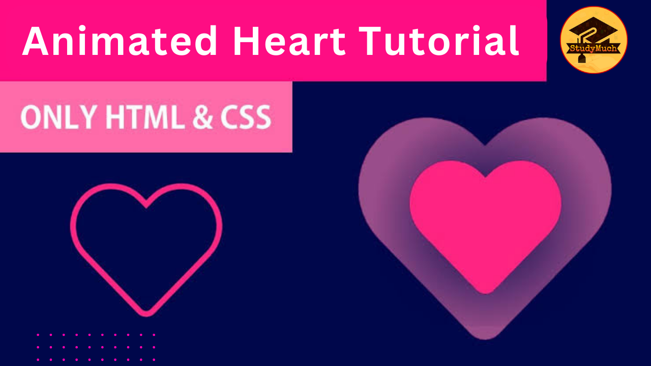
Animated Heart using HTML and CSS
Animated Heart using HTML and CSS:
Do you want to add a touch of love to your website or project? An Animated Heart is a perfect choice! In this tutorial, we will guide you in creating an attractive Animated Heart using HTML and CSS with a step-by-step guide. Let’s take a closer look at the code and understand how it works.
HTML Structure
Let’s take a look of HTML Structure, how to design a structure of Animated Heart with attractive view.
<!DOCTYPE html>
<html lang="en">
<head>
  <meta charset="UTF-8">
  <title>Animated Heart (studymuch.in)</title>
  <link rel="stylesheet" href="styles.css">
</head>
<body>
  <div class="container">
   <div class="preloader">
      <span></span>
      <span></span>
      <span></span>
    </div>
     <p id="love">I Love You</p>
    </div>
</body>
</html>
Here, we’ve created a basic HTML structure with a container div that holds a preloader (the animated heart) and a paragraph with the text “I Love You.”

Now, let’s break down the CSS Code to understand how each part contributes to the animation.
body {
    background-color: black;
}
.container {
    position: absolute;
    top: 50%;
    left: 50%;
    transform: translate(-50%, -50%);
}
.container .preloader {
    animation: rotate 2.3s cubic-bezier(0.75, 0, 0.5, 1) infinite;
}
@keyframes rotate {
    50% {
        transform: rotate(360deg);
    }
    100% {
        transform: rotate(720deg);
    }
}
.preloader span {
    --c: #f506d1;
    position: absolute;
    display: block;
    height: 74px;
    width: 74px;
    background: var(--c);
    border: 1px solid var(--c);
    border-radius: 100%;
}
.preloader span:nth-child(1) {
    transform: translate(-30px, -30px);
    animation: shape_1 2.3s cubic-bezier(0.75, 0, 0.5, 1) infinite;
}
@keyframes shape_1 {
    60% {
        transform: scale(0.4);
    }
}
.preloader span:nth-child(2) {
    transform: translate(30px, -30px);
    animation: shape_2 2.3s cubic-bezier(0.75, 0, 0.5, 1) infinite;
}
@keyframes shape_2 {
    40% {
        transform: scale(0.4);
    }
}
.preloader span:nth-child(3) {
    position: relative;
    border-radius: 0px;
    transform: scale(0.98) rotate(-45deg);
    animation: shape_3 2.3s cubic-bezier(0.75, 0, 0.5, 1) infinite;
}
@keyframes shape_3 {
    50% {
        border-radius: 100%;
        transform: scale(0.5) rotate(-45deg);
    }
    100% {
        transform: scale(0.98) rotate(-45deg);
    }
}
#love {
    color: white;
    font-weight: bold;
    animation: love 2.3s cubic-bezier(0.75, 0, 0.5, 1) infinite;
}
@keyframes love {
    25% {
        transform: rotate(360deg);
        font-size: 1px;
        color: black;
    }
    100% {
        transform: rotate(720deg);
    }
}
CSS Code Explanation;
Background and Container Styling:
- body: Sets the background color to black.
- .container: Positions the container in the center of the screen.
Heart Animation:
- .preloader: Applies the rotation animation to the entire heart.
Heart Shapes:
- preloader span: Defines the basic styling for each heart shape.
Individual Heart Shapes Animation:
- preloader span:nth-child(1), preloader span:nth-child(2), preloader span:nth-child(3): Animates each heart shape individually.
Text Animation:
- #love: Applies rotation animation to the “I Love You” text.
Keyframes:
- @keyframes rotate, @keyframes shape_1, @keyframes shape_2, @keyframes shape_3, @keyframes love: Defines the keyframes for animations.
Conclusion;
So, in this tutorial you learned how to design a delightful and colorful Animated Heart, I hope you enjoyed this tutorial and learned something new. Feel free to customize the colors, sizes, and animation durations to suit your projects’s design. Now, when you open the HTML file in a browser, you’ll witness a delightful animated heart conveying your love to the world!
Learn More;


0 Comments