CSS Border Full Tutorial with Programming Example
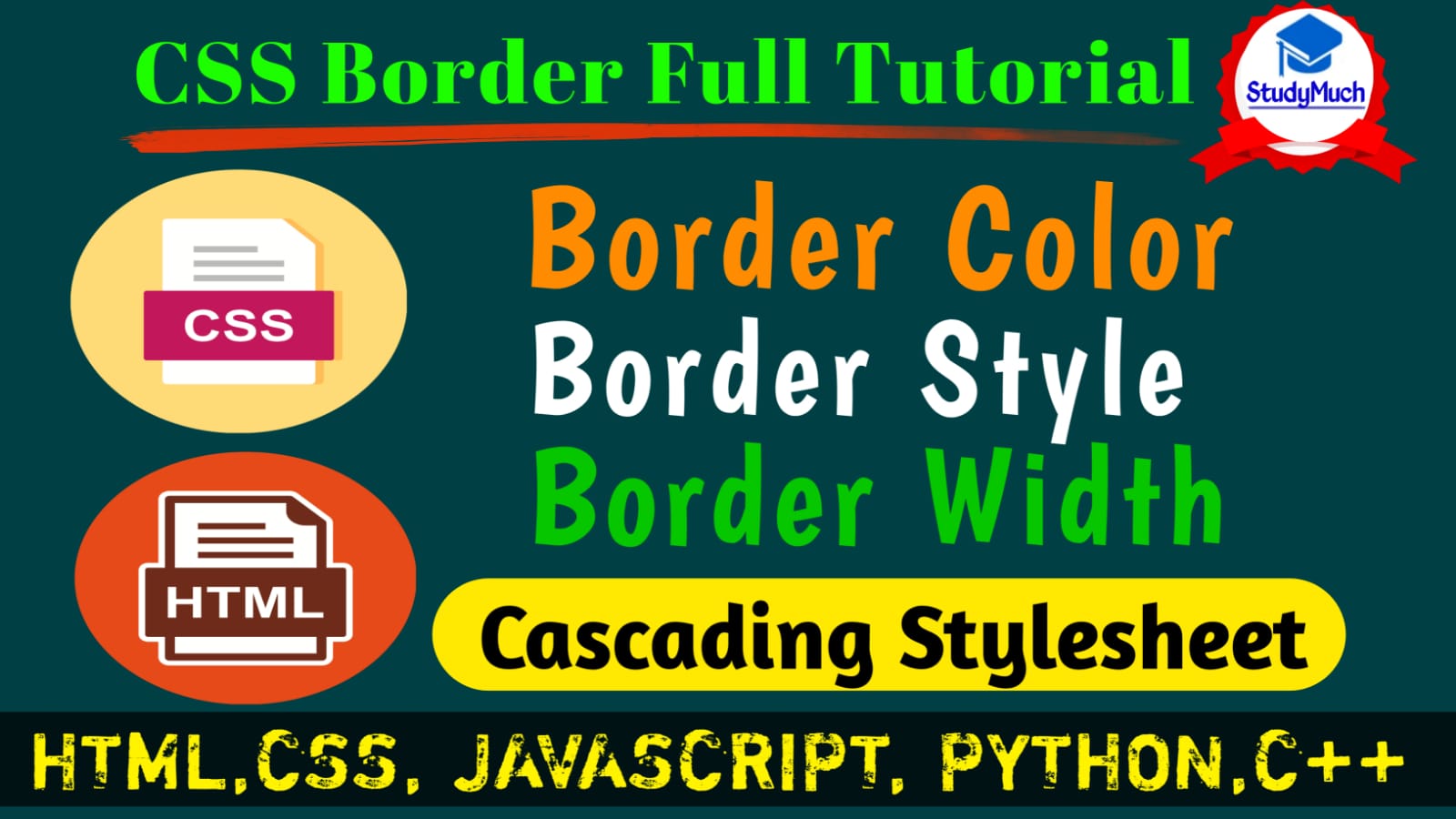
CSS Border Full Tutorial with Programming Examples.
CSS Border
In this tutorial we will be learn CSS Border, Border Style, Border Margin, Border Color etc. relative CSS Border. CSS Border is important for gave style and decorate to Border.
CSS Border is a shorthand property, it is used to style and set border on an element. The CSS Border properties are used to decorate border with the style, lines, color, margin, size and make it different shape like square and rounded border.
Border Style
Different types of border property to style the border in CSS. The border-style CSS property sets the line style for all four sides of an elements of border. Different types of border style property are as given below.
- hidden: In this property the border style is not visible, it is hidden.
- none:
Here also not display the border.
- dotted:
In this property the border displays a series of rounded dots.
- dashed: Border is displaying a series of short square-ended dashed or line segments.
- solid: Here display a single and straight solid line like a underline.
- double: In this property display two straight lines.
- groove: Display border with a carved appearance.
- inset: In this property display a border that make the element appear embedded.
- ridge: Display a border with an extruded appearance.
- outset: Display a border that makes the element appear embossed.
Now we see all the border style in an Example and also see the output of programming example.
Programming Example of Border Style
<!DOCTYPE html>
<html lang="en">
<head>
    <meta charset="UTF-8">
    <meta http-equiv="X-UA-Compatible"
content="IE=edge">
    <meta name="viewport"
content="width=device-width,
initial-scale=1.0">
    <title>Border Style</title>
    <style type="text/css">
        p.hidden{border-style: hidden;}
        p.none{border-style: none;}
        p.dotted{border-style: dotted;}
        p.dashed{border-style: dashed;}
        p.solid{border-style: solid;}
        p.double{border-style: double;}
        p.groove{border-style: groove;}
        p.ridge{border-style: ridge;}
        p.inset{border-style:inset;}
        p.outset{border-style: outset;}
    </style>
</head>
<body>
    <p class="hidden">Learn CSS Border Style
With Example. "StydyMuch" </p>
    <p class="none">Learn CSS Border Style
 With Example. "StydyMuch" </p>
    <p class="dotted">Learn CSS Border Style
 With Example. "StydyMuch" </p>
    <p class="dashed">Learn CSS Border Style
 With Example. "StydyMuch" </p>
    <p class="solid">Learn CSS Border Style
 With Example. "StydyMuch" </p>
    <p class="double">Learn CSS Border Style
 With Example. "StydyMuch" </p>
    <p class="groove">Learn CSS Border Style
 With Example. "StydyMuch" </p>
    <p class="ridge">Learn CSS Border Style
 With Example. "StydyMuch" </p>
    <p class="inset">Learn CSS Border Style
With Example. "StydyMuch" </p>
    <p class="outset">Learn CSS Border Style
With Example. "StydyMuch" </p>
</body>
</html>
|
Output of above Programming Example
 |
Border color
Now we decorate the border with color, for using the color in border we just use the border-color CSS property to defines the color of a border.
Now we see the programming example of using color in border with output.
Programming Example of border Color,
<!DOCTYPE html> <html lang="en"> <head> <meta charset="UTF-8"> <meta http-equiv="X-UA-Compatible" content="IE=edge"> <meta name="viewport" content="width=device-width, initial-scale=1.0"> <title>Border Style</title> <style type="text/css"> p.hidden{border-style: hidden;} p.none{border-style: none;} p.dotted{border-style: dotted; border-color:darkviolet} p.dashed{border-style: dashed; border-color: chartreuse;} p.solid{border-style: solid; border-color: dodgerblue;} p.double{border-style: double; border-color:darkorchid} p.groove{border-style: groove; border-color: chocolate;} p.ridge{border-style: ridge; border-color: green;} p.inset{border-style:inset; border-color: red;} p.outset{border-style: outset; border-color: blue;} div{height: 150px; width: 150; background: coral; border-width: 10px; border-color: blueviolet; border-style: groove;} </style> </head> <body> <p class="hidden">Learn CSS Border Style With Example. "StydyMuch" </p> <p class="none">Learn CSS Border Style With Example. "StydyMuch" </p> <p class="dotted">Learn CSS Border Style With Example. "StydyMuch" </p> <p class="dashed">Learn CSS Border Style With Example. "StydyMuch" </p> <p class="solid">Learn CSS Border Style With Example. "StydyMuch" </p> <p class="double">Learn CSS Border Style With Example. "StydyMuch" </p> <p class="groove">Learn CSS Border Style With Example. "StydyMuch" </p> <p class="ridge">Learn CSS Border Style With Example. "StydyMuch" </p> <p class="inset">Learn CSS Border Style With Example. "StydyMuch" </p> <p class="outset">Learn CSS Border Style With Example. "StydyMuch" </p> <div></div> </body> </html> |
Output of above Programming Example of Border Color,
 |
 |
Above output example of border color, you can see the border color is changed and a division border color is violet with groove border style.
Border Width
We can also change the border width like thin, thick etc. We specify the width of an element of border using the border-width CSS property.
Some border widths are as given below-
- thin: Using this property display a thin border width.
- thick: display a thick border width.
- medium: using this property display a medium border width.
Programming Example of Border Width;
<!DOCTYPE html> <html lang="en"> <head> <meta charset="UTF-8"> <meta http-equiv="X-UA-Compatible" content="IE=edge"> <meta name="viewport" content="width=device-width, initial-scale=1.0"> <title>Border Style</title> <style type="text/css"> p.dotted{border-style: dotted; border-color:darkviolet; border-width:5px;} p.dashed{border-style: dashed; border-color: chartreuse; border-width: 5px;} p.solid{border-style: solid; border-color: dodgerblue; border-width: 5px; border-radius: 5px;} p.double{border-style: double; border-color:darkorchid; border-width: 5px;} p.inset{border-style:inset; border-color: red; border-width: 10px; border-radius: 5px;} p.outset{border-style: outset; border-color: blue; border-width: 10px; border-radius: 5px;} </style> </head> <body> <p class="dotted">Learn CSS Border StyleWith Example. "StydyMuch" </p> <p class="dashed">Learn CSS Border Style With Example. "StydyMuch" </p> <p class="solid">Learn CSS Border Style With Example. "StydyMuch" </p> <p class="double">Learn CSS Border Style With Example. "StydyMuch" </p> <p class="inset">Learn CSS Border Style With Example. "StydyMuch" </p> <p class="outset">Learn CSS Border Style With Example. "StydyMuch" </p> <div></div> </body> </html> |
Output of above Programming Example of border width,
 |
Above you can see the programming example of border width we increase the width of doted style border, dashed style border, double style border and solid style border.
CSS Border Individual Sides
In CSS, we can the style, color, width border’s individual sides and each side like (top, bottom, left and right). We can style the border using the following CSS properties of Border.
CSS Border Individual Properties-
- border-top-style
- border-bottom-style
- border-right-style
- border-left-style
- border-top-color
- border-bottom-color
- border-left-color
- border-right-color
- border-top-width
- border-bottom-width
- border-left-width
- border-right-width
We see the example of all above property of border style, color and width one by one with output of all programming examples.
Example of changing Border Style each side.
<!DOCTYPE html>
<html lang="en">
<head>
    <meta charset="UTF-8">
    <meta http-equiv="X-UA-Compatible"
content="IE=edge">
    <meta name="viewport"
content="width=device-width,
initial-scale=1.0">
    <title>Border Style</title>
    <style type="text/css">
        div{
       border-top-style: dotted;
       border-bottom-style: dashed;
       border-left-style: double;
       border-right-style: solid;
       width: 200px;
       height: 100px;
       border-width: 10px;
       border-color: red;
       background: green;
        }
        </style>
</head>
<body>
    <div></div>
</body>
</html>
|
Output of above programming example
 |
Example of changing Border width each side,
<!DOCTYPE html>
<html lang="en">
<head>
    <meta charset="UTF-8">
    <meta http-equiv="X-UA-Compatible"
content="IE=edge">
    <meta name="viewport"
content="width=device-width,
initial-scale=1.0">
    <title>Border Style</title>
    <style type="text/css">
        div{
            border-top-width: 6px;
            border-bottom-width: 18px;
            border-left-width: 12px;
            border-right-width: 24px;
            width: 200px;
            height: 100px;
            border-style: solid;
            border-color: blue;
            background: greenyellow;
        }
        </style>
</head>
<body>
    <div></div>
</body>
</html>
|
Output of above Programming Example
 |
Example of changing Border Color each side
<!DOCTYPE html>
<html lang="en">
<head>
    <meta charset="UTF-8">
    <meta http-equiv="X-UA-Compatible"
content="IE=edge">
    <meta name="viewport"
content="width=device-width,
 initial-scale=1.0">
    <title>Border Style</title>
    <style type="text/css">
        div{
        border-top-color:coral;
        border-bottom-color: blue;
        border-left-color: green;
        border-right-color: yellow;
        width: 200px;
        height: 100px;
        border-width: 10px;
        border-style: solid;
        background: gray;
        }
        </style>
</head>
<body>
    <div></div>
</body>
</html>
|
Output of above programming example,
 |
Above output of programming example, you can see the rectangle all side of color is different.
So, in this tutorial we learned CSS Border (Border Style, Border Size and Border Color). I hope you all learned this tutorial of CSS Border and enjoyed it.
In next tutorial of CSS, we will learn a new and interesting topic of CSS.
Also Read-
- Learn CSS Background Color and Image.
- Create Stylish Contact Form with HTML and CSS.
- Create Stylish Sign-Up Page with HTML and CSS.
- Learn HTML Table with Programming Example.
- Learn HTML Form with Example.
- Learn HTML Form Input type with Example.


1 Comment
gralion torile · September 10, 2022 at 1:41 am
Thanks for one’s marvelous posting! I quite enjoyed reading it, you’re a great author.I will make certain to bookmark your blog and will eventually come back in the foreseeable future. I want to encourage yourself to continue your great posts, have a nice morning!