CSS Grid
CSS Grid
In this tutorial you will learn about the Gride view of CSS (CSS Grid), with programming and coding examples. The Grid is the very important part of CSS for designing the responsive website. let’s start the learning.
CSS Grid View
A grid is composed of grid boxes, it is used to divides a web page into multiple columns and designs the best or responsive website. It is very helpful in web design as it helps web designers easily place element on the pages.
Create Grid View
To create the Grid, first make sure that the border and padding of the elements are included in their actual or total height and width. And set the box-sizing property to border-box of all the element of the body of HTML, then you can easily create and design responsive web pages with Grid.
* { box-sizing: border-box;}
    html, body {
     margin: 0;
     padding: 0; }
The simplest form to create a grid-view is to use CSS Floats where we just need to float the boxes to the left of each other. Since we are going to use floats then we would need a container. The next step is to float the columns to the left of each other, then we can select all the columns elements. Then set the width of the boxes which should be equal to 100%.
Set Column and Row on Grid
Lots of method to set the columns and rows on CSS Grid, given below the syntax to set columns and rows .
 grid-template-columns: 200px auto;
 grid-template-columns: 3fr 2fr;
 grid-template-columns: repeat(3, auto);
 grid-template-rows: 2fr 3fr;
 grid-auto-rows: 4fr;
 grid-auto-columns:4fr;
Set Auto-fit Column & Row
You can set autofit your columns and row of grid, that benefit is our website looks responsive. Given below syntax of autofit.
grid-template-columns: repeat(auto-fit, minmax(400px, 1fr));
grid-template-rows: repeat(auto-fit, minmax(300px, 2fr));
Below created an example of grid there first box is (30% wide) is a side navigation bar and the second box is (70% wide) is where the content is goes.
Programming Example of Grid:
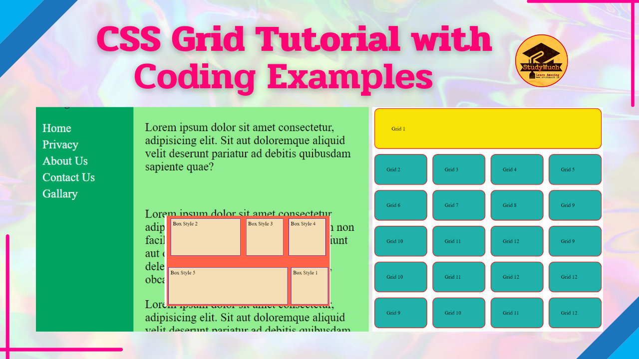
<!DOCTYPE html>
<html lang="en">
<head>
 <meta charset="UTF-8">
 <meta http-equiv="X-UA-Compatible"
 content="IE=edge">
 <meta name="viewport"
  content="width=device-width, initial-scale=1.0">
    <title>Grid View</title>
    <style>
    * { box-sizing: border-box;}
    html, body {
       padding: 0;
       margin: 0;}
    .grid::after {
       content: "";
       display: block;
       clear: both; }

   .grid div {
      float: left;
      color: lightblue;
      padding: 20px;
      height: 500px;}

   .navbar {
      width: 30%;
      background: rgb(1, 163, 96);}

   .navbar ul {
      list-style-type: none;
      line-height: 170%;
      padding: 0;}

   .navbar ul li a {
     color: white;
     font-size: 20px;
     text-decoration: none;}

   .content {
     width: 70%;
     background: lightgreen;
     color: black;}

     h3 {
     color: rgb(11, 0, 73);}
     p {
     font-size: 20px;
     color: black; }
  </style>
</head>
<body>
 <div class="grid">
  <div class="navbar">
  <h3>Navigation</h3>
   <ul>
    <li class="nav" id="nav1"><a href="#">
    Home</a></li>
    <li class="nav" id="nav2"><a href="#">
    Privacy</a></li>
    <li class="nav" id="nav3"><a href="#">
    About Us</a></li>
    <li class="nav" id="nav4"><a href="#">
    Contact Us</a></li>
    <li class="nav" id="nav5"><a href="#">
    Gallary</a></li>
   </ul>
   </div>

   <div class="content">
     <h3>Content Section</h3>
     <p>Lorem20</p <br>
     <p>Lorem30</p> <br>
     <p>Lorem20</p>
   </div>
  </div>
</body>
</html>
Output:

The above example, we create only two columns in our Grid, one is Navigation section and other is Content section, that is good when you need to create two or three columns.
Second Example of Grid:
<!DOCTYPE html>
<html lang="en">
<head>
  <meta charset="UTF-8">
  <meta http-equiv="X-UA-Compatible"
  content="IE=edge">
  <meta name="viewport"
  content="width=device-width, initial-scale=1.0">
   <title>Grid View</title>
   <style>
   .container{
       display: grid;
       grid-template-columns: repeat( 4 , 1fr);
       grid-gap: 1rem ;
        }
     .box{
       background-color: lightseagreen;
       padding: 35px;
       border: 2px solid red;
       border-radius: 15px;
        }
     .box:first-child{
       grid-column: 1 / span 4 ;
       grid-row: 1 / span 4;
       background-color: rgb(248, 227, 5);
       padding: 50px;
        }
    </style>
</head>
<body>
  <div class="container">
    <div class="box">Grid 1</div>
    <div class="box">Grid 2</div>
    <div class="box">Grid 3</div>
    <div class="box">Grid 4</div>
    <div class="box">Grid 5</div>
    <div class="box">Grid 6</div>
    <div class="box">Grid 7</div>
    <div class="box">Grid 8</div>
    <div class="box">Grid 9</div>
    <div class="box">Grid 10</div>
    <div class="box">Grid 11</div>
    <div class="box">Grid 12</div>
    <div class="box">Grid 13</div>
    <div class="box">Grid 14</div>
    <div class="box">Grid 15</div>
    <div class="box">Grid 16</div>
    <div class="box">Grid 17</div>
    <div class="box">Grid 18</div>
    <div class="box">Grid 19</div>
    <div class="box">Grid 20</div>
    </div>
</body>
</html>
Output:

Above you can see the output of programming examples, we create 21 div and set repeat value to make the columns. You can use different and different style to create best and attractive gride view.
The grid or grid system also has a downside, and that screen size is very small. For create fully responsive grid we used Media Queries CSS properties.
So, in this article you learned about the CSS Grid, its properties and also see best programming examples with output. I hope you read well and learned something amazing. If you have any questions and doubts, please ask in the comment sections.
Read Also –


0 Comments