Loader with HTML and CSS
Creating a Loader with HTML and CSS
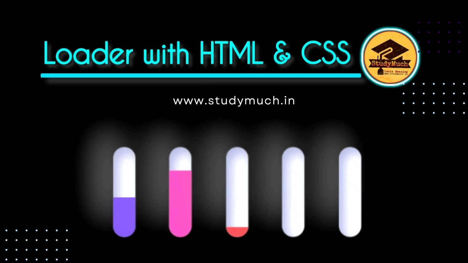
Loading animations are a great way to keep users engaged while they wait for content to load on a website. In this tutorial, we will show you how to create a simple yet attractive loader using HTML and CSS. We will provide you with the complete source code and explain step by step how it works.
HTML Structure
Let’s start by setting up the HTML structure for our loader. We will create one section element with class loader and five child div elements with class slider. Each div will represent a part of our loader animation.
<!DOCTYPE html>
<html lang="en">
<head>
    <meta charset="UTF-8">
    <title>Loader StudyMuch</title>
    <style,type="text/css">
        /* Your CSS code goes here */
    </style>
</head>
<body>
  <section class="loader">
     <div class="slider" style="--i:0"></div>
     <div class="slider" style="--i:1"></div>
     <div class="slider" style="--i:2"></div>
     <div class="slider" style="--i:3"></div>
     <div class="slider" style="--i:4"></div>
 </section>
</body>
</html>
Styling with CSS
Now, let’s add the CSS code to style our loader. We’ll explain the key parts of the CSS code step by step.
<style type="text/css">
  body {
     display: flex;
     justify-content: center;
     align-items: center;
     background: black;
     height: 50vh;
  }
  .loader {
     display: flex;
     align-items: center;
     justify-content: center;
     flex-direction: row;
   }
  .slider {
     overflow: hidden;
     background-color: white;
     margin: 0 15px;
     height: 80px;
     width: 20px;
     border-radius: 30px;
     box-shadow: 10px 5px 20px rgba(0, 0, 0, 0.1),
                 -15px -15px 30px #b8b8b8,
                 inset 5px 5px 10px rgba(0, 0, 255, 0.1),
                 inset 35px 5px 10px rgba(0, 0, 0, 0.1);
     position: relative;
  }
  .slider::before {
     content: "";
     position: absolute;
     height: 20px;
     width: 20px;
     box-shadow: inset 0px 0px 0px rgba(0, 0, 0, 0.3),
                 0px 420px 0 400px #2697f3,
                 inset 0px 0px 0px rgba(0, 0, 0, 0.1);
     animation: animate_2 1.5s ease-in-out infinite;
     animation-delay: calc(-0.2s * var(--i));
    }
  @keyframes animate_2 {
     0% {
         transform: translateY(250px);
         filter: hue-rotate(0deg);
      }
     50% {
         transform: translateY(0);
      }
     100% {
         transform: translateY(250px);
         filter: hue-rotate(180deg);
      }
   }
</style>
CSS Explanation
- We start by styling the body element to center
our loader on a black background and set the height to 50vh (50% of the viewport height) to make it visually appealing.
- The .loader class
styles the container of our loader, centering it both horizontally and vertically.
- Each .slider
represents a part of our loader. We’ve added rounded corners, shadows, and other styles to make it look visually appealing.
- The .slider::before
pseudo-element is used to create the animated element within each slider.
- We define a keyframe animation called animate_2
that moves the element vertically and changes its hue to create the loading effect.
- The animation-delay
property is set to stagger the animations of each slider.
Conclusion;
With this HTML and CSS code, you’ve created a visually appealing loader animation that you can use in your web projects. Feel free to customize the colors, sizes, and animation timings to match your website’s design. Loaders like this add a touch of professionalism and engagement to your site, enhancing the user experience during content loading. And last if you have any doubt regarding this post you can ask with any hesitation in the comment section.
Learn More;


1 Comment
canada pharmacies · October 29, 2023 at 5:42 am
Awesome! Its in fact amazing post, I have got much clear idea concerning from this post.