Circle Loader with HTML and CSS
Creating a Circle Loader with HTML and CSS
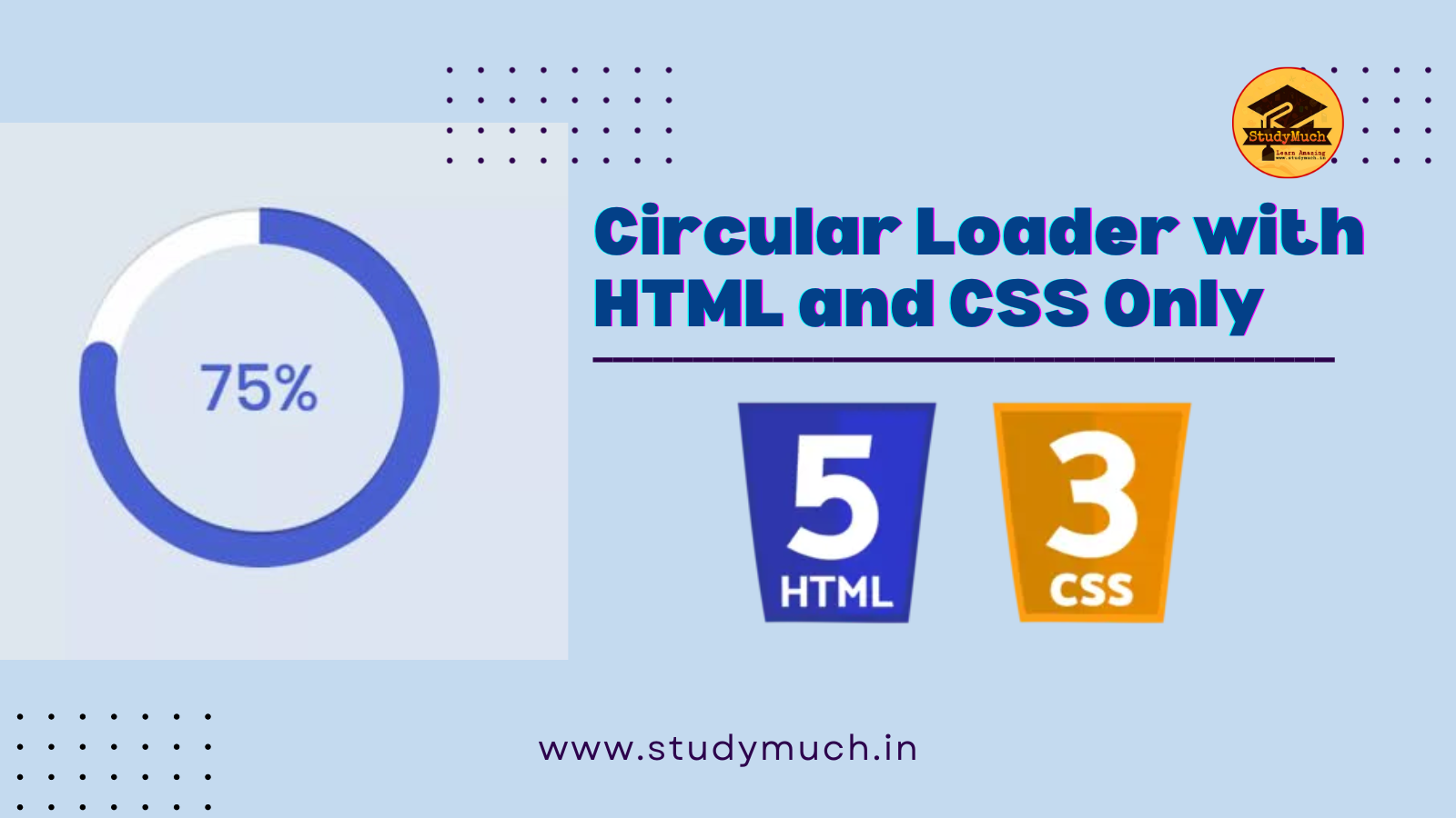
Web applications often require some type of loading animation to keep users engaged while content is being fetched or processes are running in the background. Circle Loader is a simple and visually appealing option that you can easily create using HTML and CSS (Circle Loader with HTML and CSS). In this tutorial step-by-step guide, we’ll walk you through the process of building a circle loader from scratch and explore the different customization options.
HTML Structure
Before diving into the CSS for our circle loader, let’s set up the HTML structure. This will be a minimalistic example with just the loader element.
<!DOCTYPE html>
<html lang="en">
<head>
    <meta charset="UTF-8">
    <title>Circle Loader</title>
    <link rel="stylesheet" type="text/css" href="styles.css">
</head>
<body>
    <div class="loader"></div>
</body>
</html>
In this HTML code:
- We have an HTML5 doctype declaration to ensure compatibility with modern browsers.
- The meta tags define the character encoding and viewport settings.
- We link an external CSS file named “styles.css” to apply styles to our loader.
- The loader is placed within a <div> element with the class “loader.”
Styling with CSS
Now, let’s dive into the CSS to style our circle loader. The CSS is organized into a separate file called “styles.css” for better maintainability and separation of concerns.
/* styles.css */
body {
    display: flex;
    justify-content: center;
    align-items: center;
    height: 50vh;
    background-color: rgb(0, 23, 72, 0.846);
}
.loader {
    width: 50px;
    height: 50px;
    border: 20px solid black;
    border-radius: 50%;
    border-top-color: orange;
    border-left-color: green;
    border-right-color: green;
    border-bottom-color: red;
    animation: loader-spin 2s linear infinite;
}
@keyframes loader-spin {
    to {
        transform: rotate(360deg);
    }
}
In this CSS code:
Styling the Page
- We start by styling the entire page to center the loader both vertically and horizontally. This creates a visually pleasing and responsive layout.
- The background color is set to a semi-transparent dark blue to provide contrast against the loader.
Styling the Loader
- The .loader
class defines the appearance of our circle loader. Here are the key properties:
- width and height: These properties set the dimensions of the loader, making it a perfect circle.
- border:
We create a border around the loader with a thickness of 20px. The solid style ensures that the border is continuous.
- border-radius:
By setting the border-radius to 50%, we round the edges of the square container, transforming it into a circle.
- border-top-color, border-left-color, border-right-color, and border-bottom-color: These properties determine the color of each section of the loader, giving it a multi-colored appearance.
- animation: We apply the “loader-spin” animation to the loader, creating the spinning effect.
Keyframes Animation
The @keyframes animation named loader-spin defines the animation for our loader:
- to: Represents the end state of the animation.
- transform: rotate(360deg);: This rotates the loader 360 degrees, completing a full circle.
Customization Options
Now that you have successfully created a basic circle loader, let’s explore some customization options to make it unique for your project:
1. Adjusting Size
You can change the size of the loader by modifying the width and height properties in the .loader class. For instance, if you want a larger loader, increase these values, or decrease them for a smaller loader.
.loader {
    width: 80px;
    height: 80px;
    /* ...other styles... */
}
2. Changing Colors
Customizing the colors of your circle loader is as simple as altering the border-top-color, border-left-color, border-right-color, and border-bottom-color properties. Experiment with different color combinations to match your website’s design.
.loader {
    /* ...other styles... */
    border-top-color: #ff5733; /* Change to your desired color */
    border-left-color: #44a3ff; /* Change to your desired color */
    border-right-color: #ffd700; /* Change to your desired color */
    border-bottom-color: #33ff77; /* Change to your desired color */
}
3. Adjusting Animation Speed
The animation speed of the loader is determined by the animation property’s duration value (in this case, 2s). You can make the loader spin faster or slower by changing this value. Smaller values result in faster spinning, while larger values slow it down.
.loader {
    /* ...other styles... */
    animation: loader-spin 1s linear infinite; /* Faster spin (1 second) */
}
4. Adding Text or Logo
To enhance your loader, consider adding text or a logo inside the circle. You can do this by adding HTML elements inside the .loader div. For example:
<div class="loader">
 <span class="loader-text">Loading...</span>
</div>
Then, style the loader-text;
.loader-text {
    font-size: 14px;
    color: white;
    position: absolute;
    top: 50%;
    left: 50%;
    transform: translate(-50%, -50%);
}
This will display the text “Loading…” in the center of the loader circle
Conclusion;
That’s it! You’ve created a simple circle loader with HTML and CSS. You can customize the loader’s size, colors, and animation duration to fit your project’s needs. Feel free to experiment and modify the code to create loaders with different styles and effects. Circle loaders like this one are a great way to enhance user experience while waiting for content to load or processes to complete on your website. So, I hope you liked this post, but if you have any doubts you can ask in the comment section.
Learn More;


1 Comment
tlovertonet · May 5, 2024 at 11:18 pm
What¦s Going down i am new to this, I stumbled upon this I’ve found It positively useful and it has helped me out loads. I hope to contribute & aid other users like its helped me. Good job.