Creating New Year Greeting Card using HTML CSS & JS
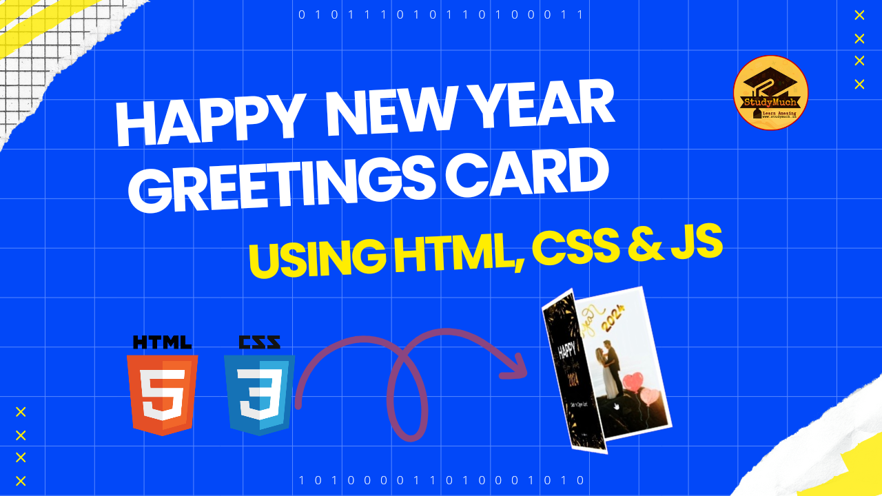
Creating New Year Greeting Card using HTML CSS & JS
As the New Year approaches, what better way to express your wishes than with a personalized greeting card? In this tutorial, we’ll guide you through the process of creating New Year Greeting Card using HTML CSS & JS (JavaScript). Feel free to use this code as a starting point and customize it to suit your preferences. New Year 2024 Greeting Card with HTML, CSS and JS.
HTML Structure
Let’s start by examining the HTML structure of our greeting card. The card is divided into different sections representing the front, inside, and outside pages. We’ve added an image of a heart and a warm New Year message inside the card.
<!DOCTYPE html>
<html lang="en">
<head>
    <meta charset="UTF-8">

    <title>New Year 2024, Greeting Card</title>
    <!-- Create and designed by StudyMuch Edtech (www.studymuch.in -->
    <!-- Add style CSS here -->
</head>
<body>
  <body>
     <div class="card">
     <div class="card-page cart-page-front">
     <div class="card-page cart-page-outside"></div>
     <div class="card-page cart-page-inside">
        <span class="new-year">
        <!--Heart Image-->
        <img src="https://shorturl.at/ntzUY" alt="">

        <!--Message of New Year-->
        <p id="msg">Happy New Year!<br> My Dear <br> ❤️I Love You❤️</p>
         </span>
     </div>
     </div>
       <div class="sc-page">
       <!--Card Inside image fame-->
      <img id="secondimg" src="https://shorturl.at/BKR36" alt="smtech">
      </div>
    </div>
   <!-- Add JavaScript Code here -->
</body>
</html>
Structure Overview:
- <body>
Tag: Represents the main content of the HTML document.
- .card Div:
Acts as the container for the entire greeting card.
- .card-page Divs: Represent pages of the card.
- .cart-page-front: Front page of the card.
- .sc-page: Inside page of the card.
- <img> Tag: Displays the second image inside the card, representing an additional visual element.

Description:
- The <body>
tag wraps the entire content of the HTML document.
- The .card
div is the main container for our greeting card.
- Inside the .card, we have two child divs representing different pages of the card:
- .cart-page-front: Represents the front page of the card. The content for this page is not explicitly provided in the code but can be added as needed.
- .sc-page: Represents the inside page of the card. It includes an <img> tag with the id of secondimg, displaying the second image inside the card.
- The src attribute of the <img>
tag points to an image URL. This image is displayed inside the card.
CSS Styles
Now, let’s delve into the CSS styles that give our greeting card its visual appeal. We’ve used a combination of styles to create a 3D card effect, set background images, and ensure responsiveness.
<style>
 @import url("https://fonts.googleapis.com/css2?family=Architects+Daughter&display=swap");
 * { box-sizing: border-box; }
body {
  background-color: #7d32f7;
  background-repeat: no-repeat;
  background-size: cover;
  height: 100vh;
  margin: 0;
  padding: 0;
  overflow: hidden;
  font-family: "Architects Daughter", cursive;}

.new-year img {
  width: 140px;
  margin-top: 20px;
  margin-bottom: 0px;}

.card {
  perspective: 1500px;
  position: absolute;
  left: 50%;
  top: 50%;
  transform-origin: center;
  transform: translate(-50%, -50%);
  transition: transform 2s cubic-bezier(0.68, -0.55, 0.265, 1.55);
  animation: cardIn 1s alternate cubic-bezier(0.87, -0.41, 0.19, 1.44);
 }

.card:before {
  content: "";
  display: block;
  position: absolute;
  left: 0;
  top: 0;
  width: 100%;
  height: 100%;
  box-shadow: 0 0 500px #000;
  transition: all 0.5s ease-in-out;}

.card.is-opened {
  transform: rotate(0deg) translate(-10px, -120px);}

.card.is-opened .cart-page-front {
  transform: rotateY(-180deg); }

@keyframes cardIn {
 0% {
    opacity: 0;
    transform: rotate(0deg) translate(-50%, -100%); }

 25% {
     opacity: 1; }

 100% {
      opacity: 1;
      transform: rotate(0deg) translate(0, -10%);}
      }

.card, .card-page {
  width: 250px;
  height: 350px; }

.card-page {
  transition: transform 1s ease-in-out;
  cursor: pointer;
  position: absolute;
  outline: 1px solid transparent;}

.cart-page-front {
  transform-origin: 0 50% 0;
  transform-style: preserve-3d;
  transform: rotateY(-20deg);
  z-index: 1; }

.cart-page-outside, .cart-page-inside {
  position: absolute;
  backface-visibility: hidden; }

.cart-page-outside {
  border: 10px solid #fbfbfb;
  background-image: #fe9001 no-repeat center;
  background-image: url(https://shorturl.at/auwI5);
  background-size: cover;
  border-radius: 5px;
  width: 100%;
  height: 100%; }

.cart-page-inside, .cart-page-bottom {
  background-color: #200581;
  background-image: url("https://www.dropbox.com/s/8hw7guch8d151kg/pattern.png?raw=1");
  border: 10px solid #f9f9f9;
  display: flex;
  justify-content: center;
  align-items: center;
  text-align: center; }

.cart-page-inside {
  transform: rotateY(-180deg);
  background-position: 0px 80px; }

.cart-page-bottom {
  z-index: 1;
  background-position: -22px 80px; }

.cart-page-bottom .new-year img {
  width: 200px;
  height: auto; }

p {
  font-size: 20px;
  color: #3c4a85;
  margin-top: 5px; }

#secondimg{
  width:250px ;
  height: 350px; }

#msg{
  color: white;
  font-size: 20;
  font-weight: bold;}

@media (max-width: 567px) {
  .card {
  left: 50%;
  top: 50%;}

.card, .card-page {
  width: 160px;
  height: 250px;}

p {
  font-size: 12px;
  color: white;}

.cart-page-bottom {
  background-position: 85px 30px;}

.cart-page-inside {
  background-position: 0px 30px;}

.cart-page-inside, .cart-page-bottom {
  border: 5px solid #f9f9f9;}

.cart-page-outside {
  border: 5px solid #fbfbfb;}

.new-year img {
  width: 100px;
  margin-top: 10px;
  margin-bottom: 0px;}

#secondimg{
  width:160px ;
  height: 250px;
  }
 }
 </style>
JavaScript Interaction
To add an interactive element, we’ve included a simple JavaScript script. Clicking on the card toggles its state, providing a delightful opening and closing animation.
<script>
  const elemCard = document.querySelector(".card");
  const elemClickIcon = document.querySelector(".click-icon");
  elemCard.addEventListener("click", function () {
    elemCard.classList.toggle("is-opened");
    elemClickIcon.classList.toggle("is-hidden");
  });
</script>
Description:
1. const elemCard = document.querySelector(“.card”);:
- Selects the HTML element with the class name “card” and assigns it to the variable elemCard. This represents the entire greeting card container.
2. elemCard.addEventListener(“click”, function () { … });:
- Adds a click event listener to the elemCard (the greeting card container).
- The event listener is triggered when the card is clicked.
3. elemCard.classList.toggle(“is-opened”);:
- Toggles the CSS class “is-opened” on the elemCard.
- The purpose of the “is-opened” class is to control the state of the card, triggering an opening and closing animation.
Conclusion;
So, in this post we learn how to creating New Year Greeting Card using HTML, CSS and JS. And also provide full source code, I hope you enjoy with this card. Feel free to explore and modify the code to suit your preferences. Add your own images, change the background color, or alter the animation timing. This New Year greeting card is a creative and personalized way to send warm wishes to your loved ones. Happy Coding and Happy New Year 2024!
Look More;


0 Comments