CSS Dropdown Menu
CSS Dropdown Tutorial
In this tutorial we will learn how to make a simple or Stylish Dropdown content and dropdown menu for your website projects. Here we create four types of dropdown menu with different – different style, we also given source code of dropdown menu in this tutorial.
First see the demo of Dropdown Menu on this Tutorial then learn the Tutorial;
Simple Dropdown Content
With CSS we make a dropdown content in HTML. A CSS dropdown is a content which is hidden by default but appears below an element, when the elements is clicked or tapped the dropdown elements show below.
Below the example of simple dropdown content.
Example of Dropdown;
<!DOCTYPE html> <html lang="en"> <head> <title>Dropdown Menu</title> <style type="text/css"> body{text-align: center; align-items: center;} .div1{position: relative; display: inline-block;} .dropdown{position: absolute; display: none; align-items: center;} p{border: 1px solid blue; background:lightblue; padding: 5px; border-radius:20px; width: 50%;} .div1:hover > .dropdown {display:contents;} span{cursor: pointer; border: 1px solid blue; padding: 5px; font-weight: bold; color: red; border-radius: 20px;} </style> </head> <body> <div class="div1"> <span class="button"> Mouse Over Me</span> <div class="dropdown"> <p>Lorem20</p> </div> </div> </body> </html> |
Output of above programming example;
 |
This is the video of above programming example output;
Above video you can see, when the mouse pointer is above the “Mouse Over Me” button then a dropdown paragraph is shown below.
In above simple example of dropdown, we used the <span> element in first line which hovered the second element which is hidden then <div> with dropdown class name will show below.
The position: relative declaration of the container and the position: absolute of the dropdown make it be rendered right below the <span> element.
You can also use the <button> element for button inside the <span> element.
Stylish CSS Dropdown Menu
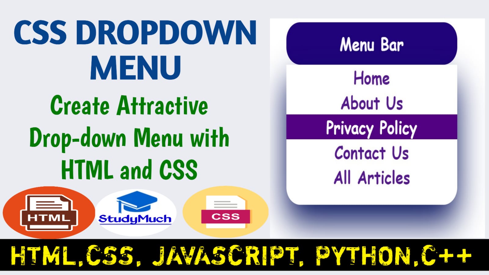
Now, here we make a simple and stylish beautiful dropdown menu, here we will use the <button> element for button. Here we make a navigation of website “menu bar“. Below the source code and output of programming.
Programming Example of Dropdown Menu;
<!DOCTYPE html> <html lang="en"> <head> <title>Dropdown Menu</title> <style type="text/css"> .div1{position: relative; display: inline-block;} .button{padding: 10px; text-align: center; border: 2px solid green; background:blue; width: 200px; font-size: large; font-weight: bold; font-family:cursive; color: white;} .div1:hover > .dropdown { display: block;} .dropdown{position: absolute; display: none; width: 100%; box-shadow: 0 20px 40px rgb(2, 3, 92);} .dropdown > a {display: block; text-decoration: none; text-align: center; font-size: large; font-family: cursive; font-weight: bold;} .dropdown > a:hover{color: white; background: rgb(16, 131, 1);} </style> </head> <body> <div class="div1"> <button class="button">Menu Bar</button> <div class="dropdown"> <a href="#">Home</a> <a href="#">About Us</a> <a href="#">Privacy Policy</a> <a href="#">Contact Us</a> <a href="#">All Articles</a> </div> </div> </body> </html> |
Output of above programming example;
 |
Output video of above programming example;
Above video you can see the “Menu Bar” Dropdown Menu when we click and over the mouse its dropdown below. You can get this source code and make your own style and make it look like you want.
CSS Dropdown Menu, Slide Down Effect
Here we create the slide down effect of dropdown menu. To create this first we need to set the height of dropdown menu is 0px and use overflow: hidden then then the content is not show. See below the programming example.
Programming Example of Slide Down Dropdown Menu;
<!DOCTYPE html> <html lang="en"> <head> <title>Dropdown Menu</title> <style type="text/css"> body{align-items: center; text-align: center;} .div1{position: relative; display: inline-block;} .button{padding: 10px; text-align: center; border: none; background:rgb(32, 2, 122); width: 250px; border-radius: 20px; font-size: large; font-weight: bold; font-family:cursive; color: white;} .button:hover{border-bottom-left- radius: 0px;border-bottom-right -radius: 0px;} .div1:hover > .dropdown {display: block; border-bottom-left-radius: 20px; border-bottom-right-radius:20px;} .dropdown{position: absolute; width: 100%; box-shadow: 0 20px 40px rgb(2, 16, 92); height: 0px; transition: height 3s; overflow: hidden;} .div1:hover > .dropdown{height: 160px;} .dropdown > a {display: block; text-decoration: none; text-align: center; font-size: large; font-family: cursive; font-weight: bold;} .dropdown > a:hover{color: white; background: rgb(83, 1, 131);} </style> </head> <body> <div class="div1"> <button class="button">Menu Bar</button> <div class="dropdown"> <a href="#">Home</a> <a href="#">About Us</a> <a href="#">Privacy Policy</a> <a href="#">Contact Us</a> <a href="#">All Articles</a> </div> </div> </body> </html> |
Output video of above programming example;
Above output video, you can see how sliding down the Menu Bar height within 3 second, but you can set your own choice animation time on your own project and make stylish your projects.
CSS Dropdown Menu Fade in Effect
Here we use opacity: 0; to hide the content and remove the display: none; to fade effect of dropdown menu. And add transition: opacity 2s; than you program is fade affection. Look below the programming example.
Programming Example Dropdown Menu Fade Effect;
<!DOCTYPE html> <html lang="en"> <head> <title>Dropdown Menu</title> <style type="text/css"> .div1{position: relative; display: inline-block;} .button{padding: 10px; text-align: center; border: 2px solid green; background:rgb(16, 122, 2); width: 200px; border-radius: 20px; font-size: large; font-weight: bold; font-family:cursive; color: white;} .button:hover{border-bottom-left -radius: 0px; border-bottom -right-radius: 0px;} .div1:hover > .dropdown {display: block; border-bottom-left-radius: 20px; border-bottom-right-radius:20px;} .dropdown{position: absolute; width: 100%; box-shadow: 0 20px 40px rgb(2, 3, 92); opacity: 0; transition: opacity 2s;} .div1:hover > .dropdown{opacity: 1;} .dropdown > a {display: block; text-decoration: none; text-align: center; font-size: large; font-family: cursive; font-weight: bold;} .dropdown > a:hover{color: white; background: rgb(1, 21, 131);} </style> </head> <body> <div class="div1"> <button class="button"> Menu Bar</button> <div class="dropdown"> <a href="#">Home</a> <a href="#">About Us</a> <a href="#">Privacy Policy</a> <a href="#">Contact Us</a> <a href="#">All Articles</a> </div> </div> </body> </html> |
Output video of above programming example;
You can see the above programming output video, how to work the dropdown menu, it fades affecting with given time we put 1s time, but you can change the sliding time, with your choice.
In this we learned the CSS Dropdown content and Dropdown Menu, here we learn how o style the Dropdown menu of HTML through the different types of CSS properties. I hope you all read this tutorial and learn something from this Dropdown Menu tutorial. If you have doubt, you can ask in the comment section, I can try to give your question’s answers and clear your doubts.
Read Also-
- Learn all Tutorial of HTML with Programming Examples.
- Learn CSS Animation with examples.
- Learn about All about Internet. Is internet really free?
- Learn important Questions & Answers about Computer.
- Learn all Tutorial CSS with Programming Examples.


1 Comment
tlover tonet · July 1, 2024 at 1:44 am
I appreciate, cause I found just what I was looking for. You’ve ended my four day long hunt! God Bless you man. Have a great day. Bye