Stunning 3D Flip Birthday Card
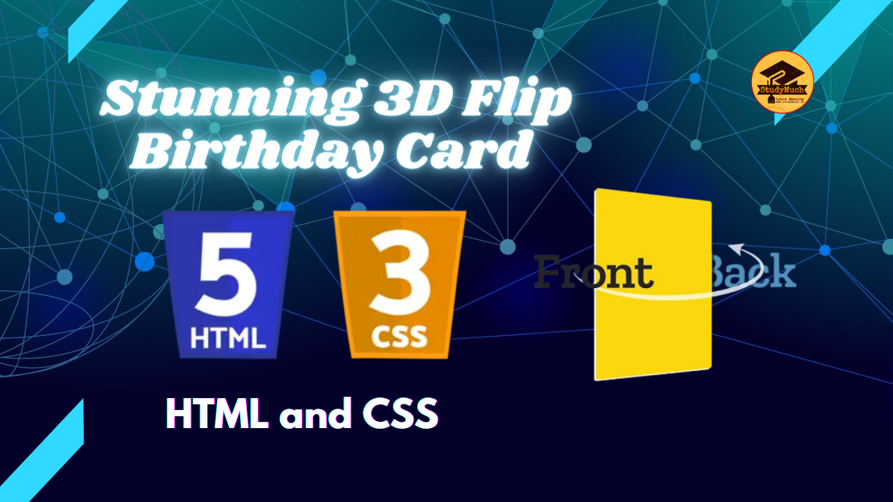
Stunning 3D Flip Birthday Card with CSS
Are you looking to add a touch of magic to your loved one’s birthday card? How about creating a 3D flip effect that will make their special day even more memorable? In this blog post, we’ll dive into the world of CSS and explore how to create a stunning 3D flip birthday card that is sure to impress. With just a few lines of code, you can bring this interactive greeting card to life.
HTML Structure
Let’s start by setting up the HTML structure for our 3D flip birthday card. Here’s the basic code:
<!DOCTYPE html>
<html lang="en">
<head>
  <meta charset="UTF-8">
  <title>3D Flip Birthday Card</title>
  <link rel="stylesheet" href="styles.css">
</head>
<body>
 <div class="card">
  <div class="card-front">
  <!-- Front content goes here -->
 </div>
  <div class="card-back">
  <!-- Back content goes here -->
   </div>
  </div>
</body>
</html>
In the above code, we have a simple HTML structure. The .card
element acts as the container for our flip card, and it contains two child elements: .card-front
and .card-back. These elements represent the front and back faces of our 3D flip card, respectively.
CSS Styling
Now that we have the HTML structure in place, let’s move on to the CSS styling. We’ll use CSS to create the 3D flip effect and customize the appearance of the card. Create a new file called styles.css and link it to your HTML file using the <link> tag in the <head> section.
Here’s the CSS code for our 3D flip birthday card:
.card {
  position: relative;
  width: 300px;
  height: 400px;
  perspective: 1000px;
}
.card-front, .card-back {
  position: absolute;
  top: 0;
  left: 0;
  width: 100%;
  height: 100%;
  backface-visibility: hidden;
  transition: transform 0.8s;
}
.card-front {
  transform: rotateY(0deg);
  background-color: #eaeaea;
}
.card-back {
  transform: rotateY(180deg);
  background-color: #4158D0;
  color: #fff;
  text-align: center;
}
.card:hover .card-front {
  transform: rotateY(-180deg);
}
.card:hover .card-back {
  transform: rotateY(0deg);
}
Let’s go through the CSS code step by step:
- The .card class sets the container element’s position, width, height, and perspective. The perspective property gives us the 3D depth effect.
- The .card-front and .card-back classes style the front and back faces of the card, respectively. They are positioned absolutely within the container and take up the entire space.
- The backface-visibility property is set to hidden to hide the back face of the card when it is facing forward.
- We apply a CSS transition to the transform property with a duration of 0.8 seconds to create a smooth flipping animation.
- The .card-front initially has a rotateY(0deg) transform to keep it facing forward. We set its background color to a light shade (#eaeaea), but you can customize it to your liking.
- The .card-backinitially has a rotateY(180deg) transform to make it face backward. We set its background color to a vibrant shade (#4158D0) and the text color to white. Feel free to adjust these colors to match your desired theme.
- On hover, we change the rotateY transform values to -180deg and 0deg for .card-front and .card-back, respectively. This creates the flipping animation when the user hovers over the card.
Adding Content
Now that we have our CSS styling in place, it’s time to add content to our card. Replace the placeholders within the <div> tags to add your own text, images, or any other elements you want to include on the front and back faces of the card. For example:
<div class="card-front">
  <h2>Happy Birthday!</h2>
  <p>Wishing you a fantastic day filled with joy and laughter.</p>
  <img src="front-image.jpg" alt="Birthday cake">
</div>
<div class="card-back">
  <h2>Surprise!</h2>
  <p>Hope you love the surprise inside this card!</p>
  <img src="back-image.jpg" alt="Gift box">
</div>
Feel free to get creative and customize the content to suit the recipient’s taste and interests.
Conclusion
Congratulations! You’ve successfully created a stunning 3D flip birthday card using CSS. By combining HTML and CSS, you’ve brought interactivity and excitement to the traditional concept of a birthday card. The 3D flip effect adds a delightful surprise and will surely make your loved one’s special day even more memorable.
Remember to save your HTML and CSS files in the same directory and open the HTML file in a web browser to see the magic of the 3D flip birthday card come to life. You can further customize the styling, dimensions, and content to create unique and personalized birthday cards for your friends and family. Now, it’s time to spread joy and celebrate those special moments with your beautifully crafted 3D flip birthday cards. Happy coding and happy birthday wishes!
Learn More;


1 Comment
tlovertonet · May 7, 2024 at 7:00 am
This web site is really a walk-through for all of the info you wanted about this and didn’t know who to ask. Glimpse here, and you’ll definitely discover it.